A Journey through Art and Making Comics.
A comic book nerd who enjoys creating art. This artist blog, RSC Arts is where he shares his creative process, insights, inspirations, and comics.
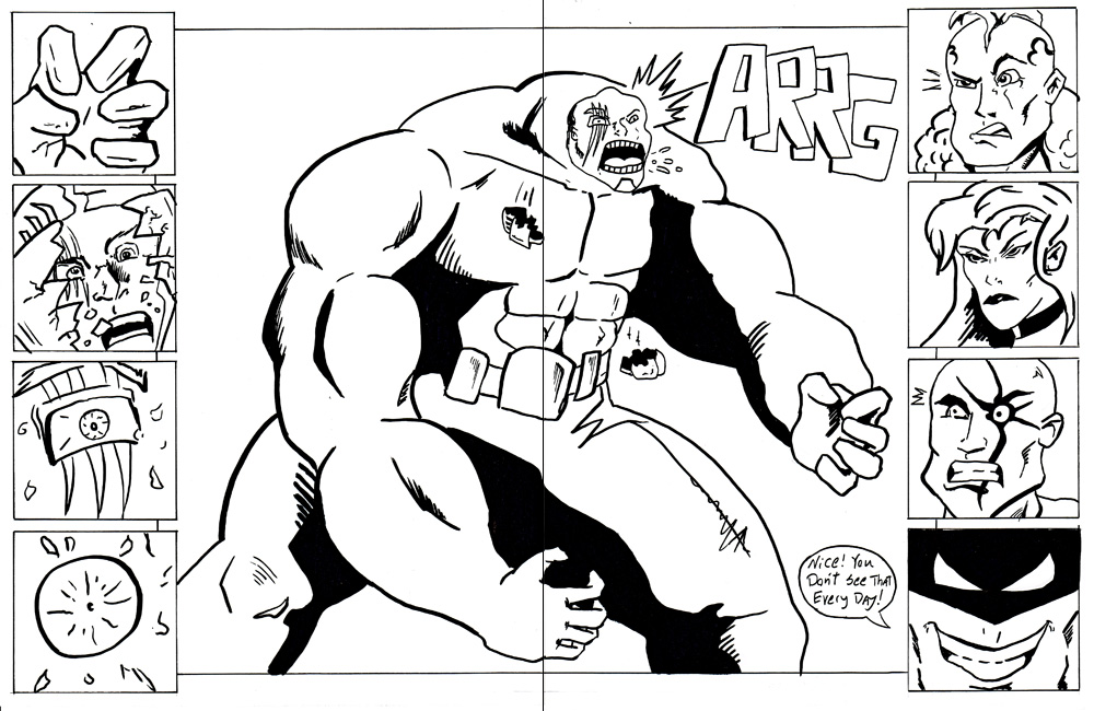
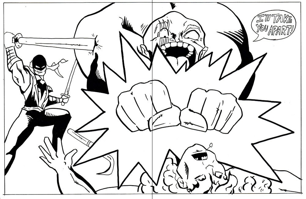
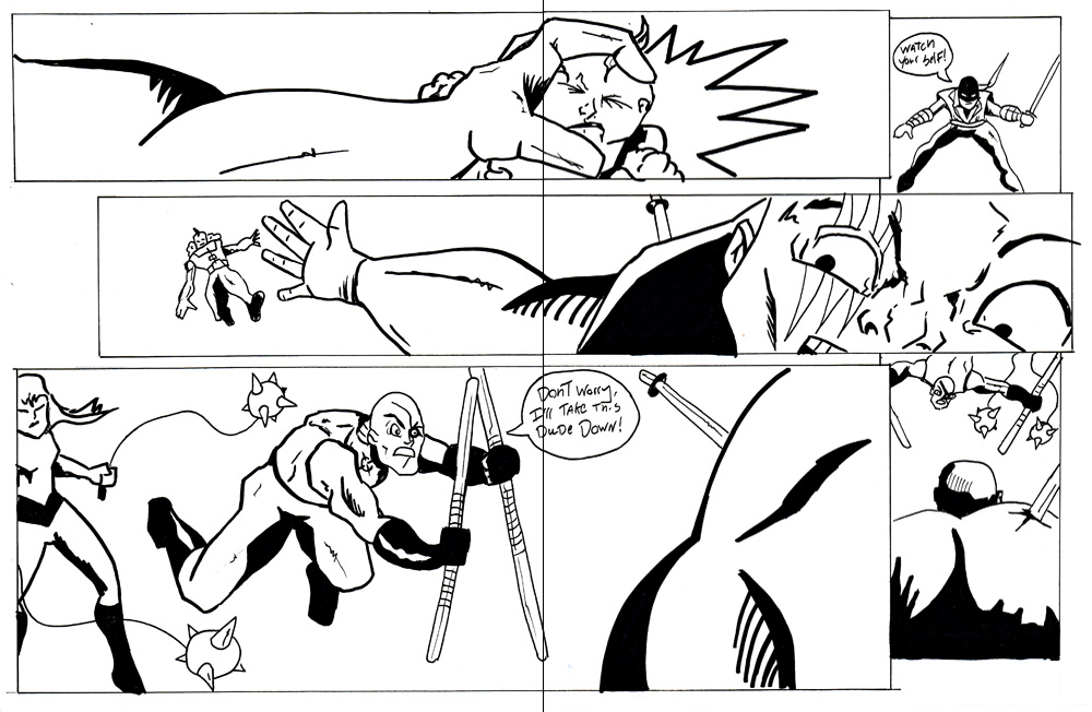
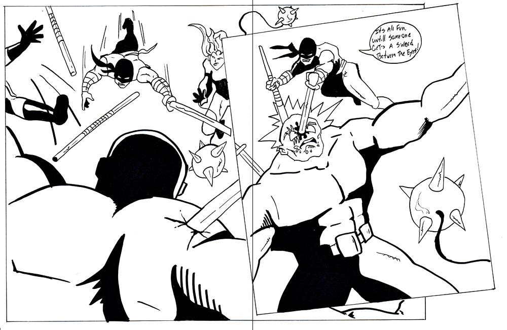
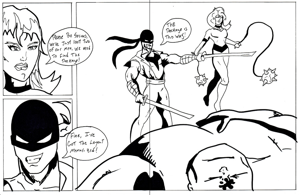
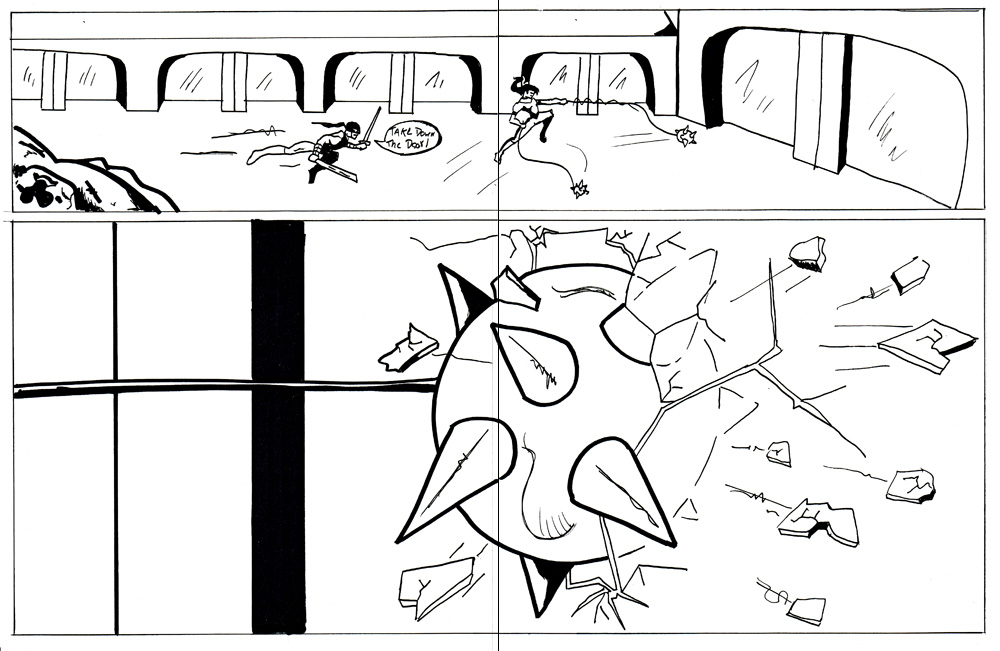
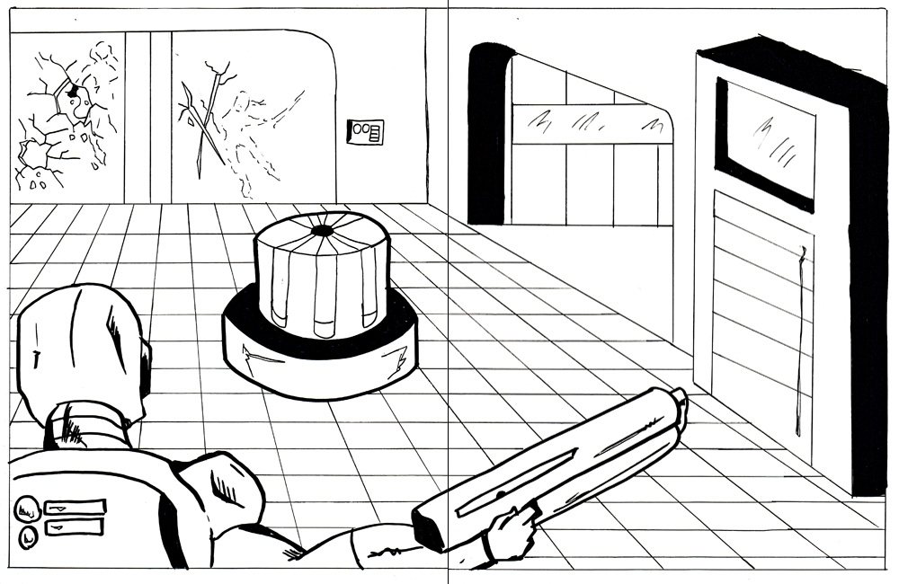
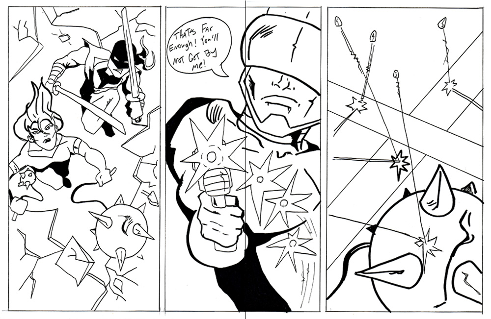
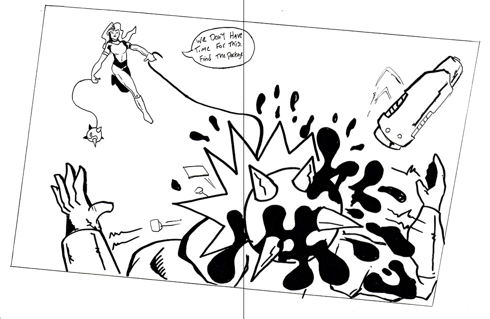
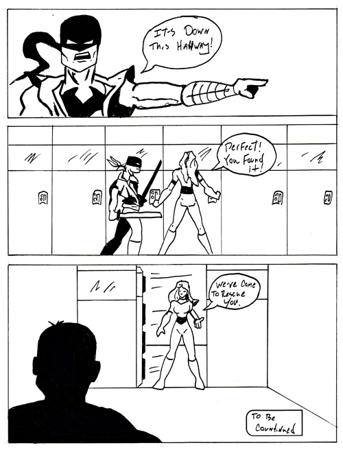
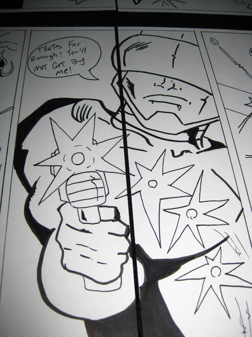
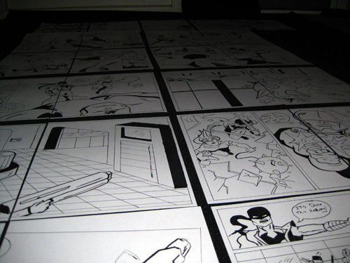
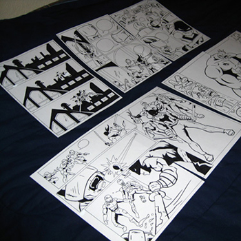
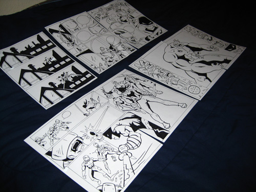
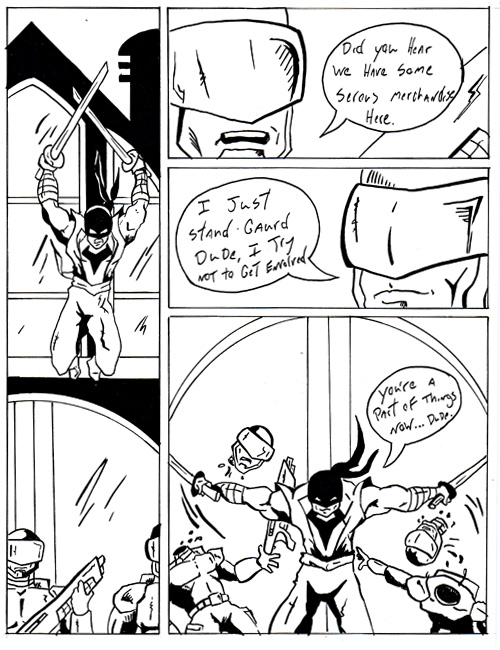
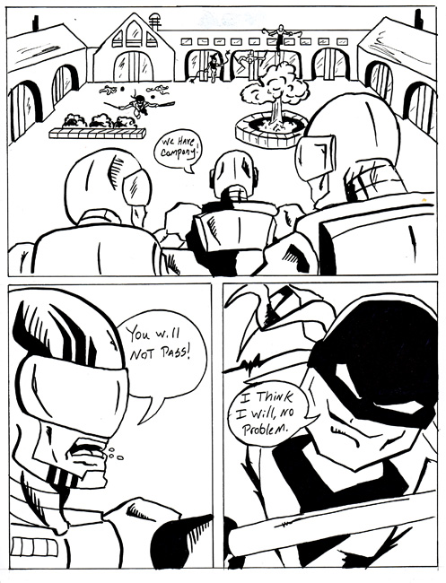
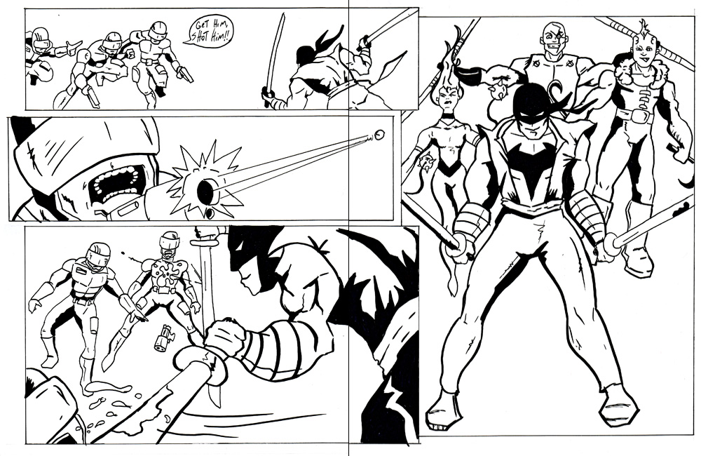
This year I participated in 24-Hour Comics Day again. It was held from October Saturday the 3rd to the 4th. I had such a blast with it last year that there was no question I would do it again. The goal is to create 24 comic pages in 24 hours. It’s a very challenging exercise. You come to the table with no idea of what you are going to write and draw, and from there you create a 24-page story.
Last year there was a place to participate in 24 Hour Comic in Santa Fe NM (that’s where I live right now), but this year the closest place was in Albuquerque, NM. I decided to stay home and work on the 24-hour comic on my drawing table. I was committed to participating no matter where I did it.
The first few hours were tough, the year before I created my 24-hour comic with the help of my girlfriend as my inker. This year I was working completely solo. I was finding it hard to find a fast rhythm. I was really digging what I was coming up with, but I was just a little slower than I originally wanted to be.
My girlfriend helped me out by updating my Twitter, Facebook & Flickr pages. One of the Twitter updates caught the attention of the group in Albuquerque. They were updating their blog dedicated to the 24-Hour comic and told me to send them some photos of my stuff. You can check out the 1st of 2 posts showing my work progress during the event. 24 hours from the New Mexico blog (Hour 13 1/2 from New Mexico). What was cool is the blog post was picked up by the Official Nation 24-Hour Comic Book Blog too. – (Hour 13 1/2 from New Mexico)
This blog post was originally published on my former website, Comic Book Graphic Design and has now been migrated here to RSC Arts, Artist Blog.
The Daily Comic Sketch Challenge – Enchantress (Marvel)
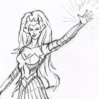
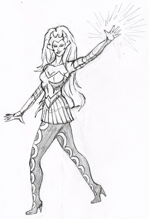
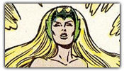
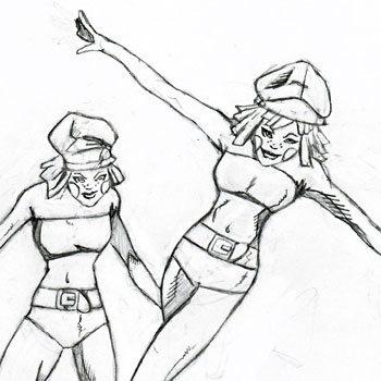
The Daily Comic Sketch Challenge! Here’s the 3rd quick 30-minute daily sketch. This drawing was done on Wednesday, October 7th of Amora The Enchantress from Marvel Comics.
This sketch was very challenging for me. It took me a little longer than my allowed 30 minutes, about 45. I started with a real rough sketch using an H2 drafting pencil. I was trying to give her a soft look, but I think she actually looks a little stiff. This is why I’m doing this daily exercise. To help me get a loose and softer drawing style. I find that there is stiffness in my illustrations sometimes when I work on them too much.
The enchantress was one of the first female characters I read in comics. The second comic I ever read was Marvel Super Heroes: Secret Wars, but it was the 1st series I actively read. I remember hitting all the gas stations looking for the latest issue. So it was fun drawing a character I’ve been familiar with most of my comic reading and drawing life.
This blog post was originally published on my former website, Comic Book Graphic Design and has now been migrated here to RSC Arts, Artist Blog.
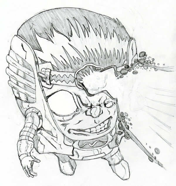
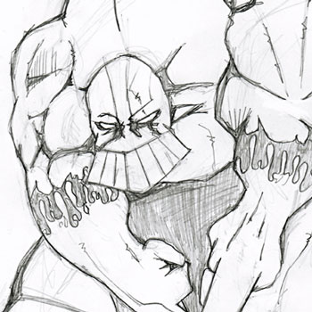
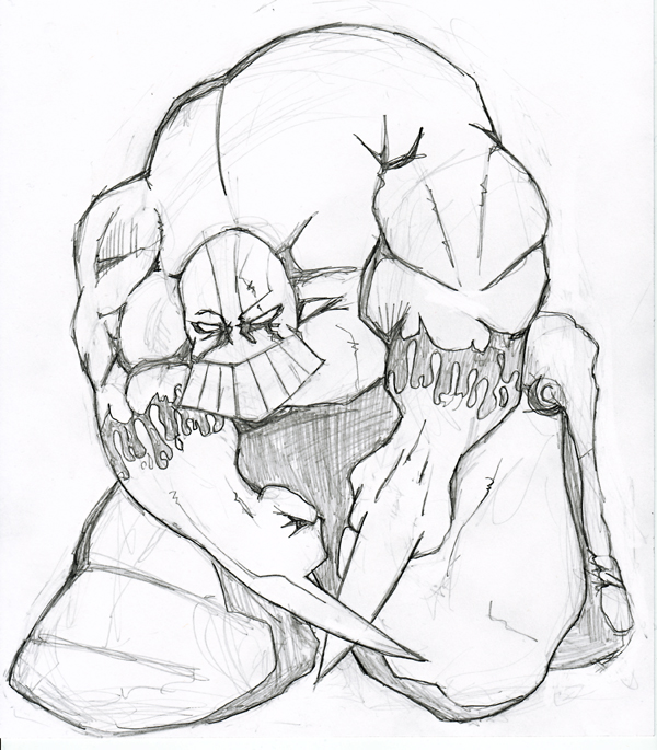
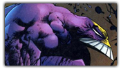
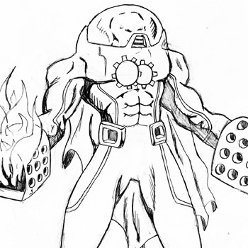
The Daily Comic Sketch Challenge! Here’s the 2nd quick 30-minute daily sketch. This drawing was done on Tuesday, October 6th. The Maxx by Sam Kieth was suggested by my friend Carlos Parra via his Twitter account @carlosparra
This was a fun character to draw. I knew I wanted to make him big and exaggerated. That’s the way I remembered him. Never drawing the Maxx before I was very excited to have fun with this. I was able to get the sketch done in 35 minutes. I used an H2 drafting pencil. I think I had better control of it than the HB I used for the last quick sketch.
I remember when I had my comic book store, The Maxx Comic was always a very popular character. I literally could not keep the comics in stock. This was years after its publication too. I think it was so popular because of Maxx, MTV Cartoon. Which was great because it brought the character and comics to a more mainstream audience.
This blog post was originally published on my former website, Comic Book Graphic Design and has now been migrated here to RSC Arts, Artist Blog.
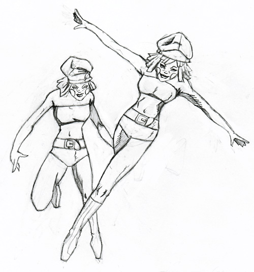
The Daily Comic Sketch Challenge – Manhunter IV (Marc Shaw)
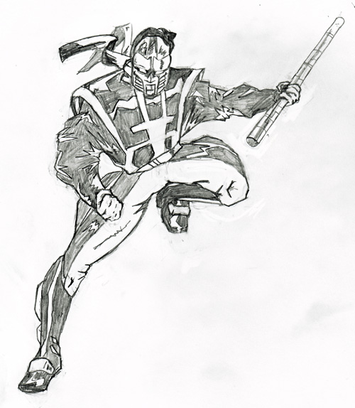
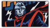
Last night I drew the 1st in a series of quick 30-minute daily sketches. I’m calling them The Daily Comic Sketch Challenge. After asking for suggestions on Twitter and DeviantArt the first drawing is The Manhunter IV (Marc Shaw).
I had fun with this drawing. I’ve never really read any comic with this Manhunter, but the costume design is very cool. I actually took a little longer than 30 minutes, I think I took about 45. I used an HB drafting pencil, Only sharpening it once. With this drawing, I tried to be quick, but not lose detail. I also tried to use shadow and reflection of light. Thanks to @BlaqueSaber on Twitter for the great suggestion!
This blog post was originally published on my former website, Comic Book Graphic Design and has now been migrated here to RSC Arts, Artist Blog.
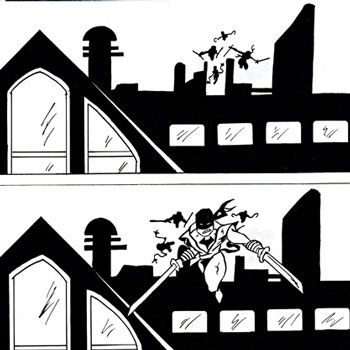
I’ve decided to give myself daily exercise to help in my drawing skills. I call it The Daily Comic Sketch Challenge. This next week I will be doing a quick drawing for only 30 minutes. These drawings will be of random comic book characters. Not only will I get to draw some different characters, but it will help in sharpening my drawing skills.
Last week I asked for suggestions through my Twitter and DeviantArt accounts on who I should draw. I received a lot of great ideas. Here is a list of which characters I will be drawing this 1st week.
I’ll be posting a new Daily Comic Sketch every day. If you have any suggestions on who I should draw next, please let me know. – SHAZAM!
This blog post was originally published on my former website, Comic Book Graphic Design and has now been migrated here to RSC Arts, Artist Blog.
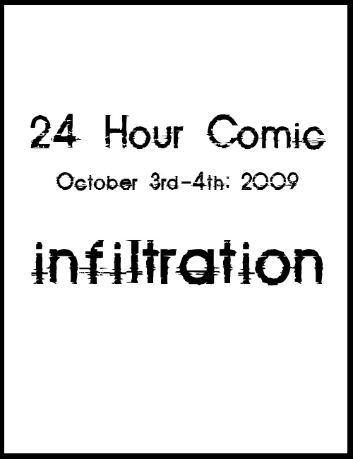
Sometimes you can find the most awesome stuff in the most unexpected places. This last weekend I was at the supermarket buying groceries and out of nowhere, my girlfriend pulls out a Hand Scythe. She intended to scare me, but instead, I was very excited. This plastic toy was a perfect match to the weapon used by one of my characters, the “Grimm Creeper”. I had to buy it. Luckily I was able to find a second one too.
Halloween is always a great time to find plastic weapons and cosplay items. Last year we found a cool life-size Captain America shield, and this year it’s the Grimm Creeper’s scythe weapons.
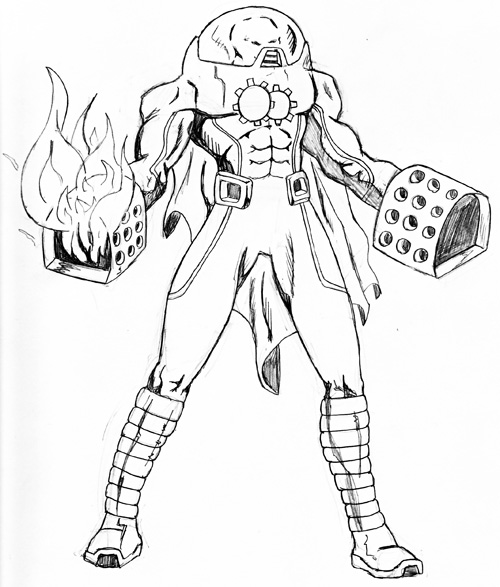
In my original sketch of the Grimm Creeper, I had drawn his weapons very similar to the ones I recently found. In later drawings, I modified and stylized the scythes. After holding and simulating how the weapons work in a fight (I was testing them out in the supermarket), I’ve decided to go back to my original concept: a simple and direct weapon.
It’s really great having these props. I now have several ideas on how he can wield his weapons. I know that it will help me to come up with better action poses when I draw his fight scenes.
This blog post was originally published on my former website, Comic Book Graphic Design and has now been migrated here to RSC Arts, Artist Blog.
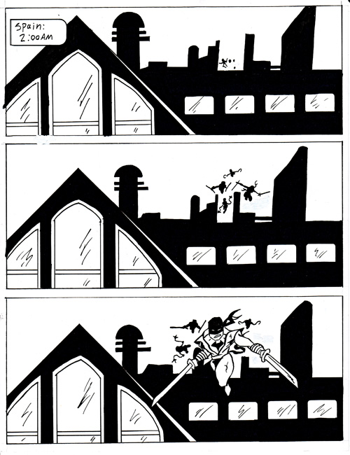
Here are some quick Zombie Sketches. To help keep the Dark New World zombie comic book fresh and new, I decided to sketch out a bunch of zombies’ faces. This way, I can choose which ones I want to use in the comic. I don’t just want a bunch of stereotypical bland zombies. My goal is to have over 50 different zombies already designed for the comic when I start penciling the sequential pages.
I’ve been looking at people to get ideas for the different-looking zombies. I’ll be at the mall or the gas station, looking at the characteristics of all the different people. So basically I’ve been people-watching and re-imaging them as zombies.
I’ve tried to make them retain some of the human characteristics, but still bring the horror I feel when I think of zombies—with some rotting flesh, biting jaws, and dead eyes.
This blog post was originally published on my former website, Comic Book Graphic Design and has now been migrated here to RSC Arts, Artist Blog.
Character Designs of The Carnies – Dark New World Zombie Comic
In this new chapter of Carlos Parra’s “Dark New World“. You will be introduced to many new characters. Enter “The Carnies“, a group of marauders who have survived the initial zombie infestation that hit Las Cruces, NM. “Sometimes the monsters do have smiles on their faces.”
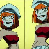
Here are my first Character Designs sketches of ‘The Carnies” for the upcoming zombie comic book. Carlos wanted the feel of “A Clock Work Orange” mixed with creepy-looking carnies. I was given sketch samples of their different pained faces, and from there I designed their looks. At this point, the Carnies as individuals do not have names. Which I think actually makes them a bit scarier.
I’m currently workings on the first few pages of the comic book. The Carnies are making a huge impact on the lives of the survivors. In the future, I will post some of the sequential page thumbnails, but not too many. Don’t want to give away the story.
This blog post was originally published on my former website, Comic Book Graphic Design and has now been migrated here to RSC Arts, Artist Blog.
Original Captain Marvel Drawing By Comic Book Artist Eric Merced
I’ve been very active on Twitter for the past few months. I’ve actually maxed out the number of people I can follow (which is 2001). I would say that about 80% of the people I follow are comic book artists, writers, and fellow fans. Well, a few weeks ago I saw a contest for an original drawing from comic book artist Eric Merced through his Twitter account @eric_merced. “1st and 5th to tweet a character for me to draw on live stream…” I tweeted my favorite character Captain Marvel and was the 1st to enter and win the contest!
The cool thing about the live stream was I got to see him draw it live. Eric Merced talked about why he liked the character of Captain Marvel while he sketched him out. It was really interesting to see the process he used when going from sketching to drawing and finally to inking. He also had a question/answer session with other people watching via a chat widget. The original drawing is 7″ x 5″ and he gave it to me, which was very awesome of him!
As a fun added pulse the mailer that the drawing came in had a cool drawing of Captain Marvel too. Thanks, Eric Merced for an awesome original drawing! Shazam!
This blog post was originally published on my former website, Comic Book Graphic Design and has now been migrated here to RSC Arts, Artist Blog.
Digital Inking with Illustrator Vector Anchor Points
I’ve received several requests to show the steps I used to create my digital inking of the Fantastic Four pin-up I did of artist Ariel Padilla’s pencils. I was looking for some art to ink and found the pencils on his DeviantArt page. This was a practice exercise I gave myself in the inking process of comic book art using Adobe Illustrator. I’ve been a graphic designer for over 9 years but this was the first time I used my design knowledge for comic book inking.
For this self-assignment, I decided to use Adobe Illustrator for inking the pin-up. I had used photoshop for a previous piece earlier I did of Batman 2.0, a character redesign. I had fun with that illustration but this time I wanted to do this digital inking in vector format. Why choose vector verse bitmap? Well, a vector image is made up of anchor points that are connected by paths (lines) that connect them. A vector image can be re-sized without loss of quality to the illustration. So basically you can re-size the image as small or as large as you’d like without pixelation, it will keep its sharpness no matter the size. Which is really neat.
Points & Paths: Example 2
For this illustration, I choose to use my anchor points to create only straight paths (lines). I didn’t use any curved lines. The cool thing about using anchor points and paths is that you can make curved paths, resulting in fewer points This is shown in Points & Paths: Example 2. So why didn’t I use curve paths? Well, honestly it was a self-exercise to see if I could do it. I wanted to create curved lines through straight lines. I found it to be a fun challenge.
I did not create lines or outlines of the original pencils. What I did was look at each line as a shape. I could have easily used the brush tool in Illustrator, but I found I actually had more control over what I wanted to achieve by using the pen tool.
Points & Paths: Example 3
With the technique, I like to use anchor points and paths I am able to get a type of jagged smooth shape. The strength of anchor points is you can use as many or as few points as you’d like to create your lines or shapes. I’ve illustrated this in Points & Paths: Example 3.
Points & Paths: Example 4
After I created the shape from the pencils, I colored it in black. I’ve shown this in Points & Paths: Example 4. As you can see it’s a piece of a puzzle that makes up the inking. These shapes help to create the feel I was looking for when digitally inking this drawing. This technique really works well when inking the Thing’s rocky skin.
Points & Paths: Example 5
I have included more examples of the anchor points and paths technique I use in inking these pencils. In Points & Paths: Example 5, we see how the wavy fire on Human Torch can be created without using curved lines. Every anchor point in the flames helps to create the illusion of line weight, depth, and movement.
Points & Paths: Example 6
In Points & Paths: Example 6, I’ve shown how I created what looks to be a line on the Invisible Woman’s arm. It is actually a curved shape created with paths. It is a shape that includes the bottom line of her arm and the shadows around her neck. You can see her hands and the background is already colored in.
Although this technique might not seem to be the most efficient, it allows for a lot of control. Looking at each line as a shape helped me to create a type of line work I would not have achieved otherwise.
This was my first comic book digital inking using Adobe Illustrator with the anchor points and paths technique. I have done a few more since this one. Although I have used curved lines in those illustrations. This was a fun self-exercise in learning to digitally ink the work of someone else. I am very happy with the way this illustration came out, and I’ll continue to use Adobe Illustrator to digitally ink comic book pencils.
This blog post was originally published on my former website, Comic Book Graphic Design and has now been migrated here to RSC Arts, Artist Blog.