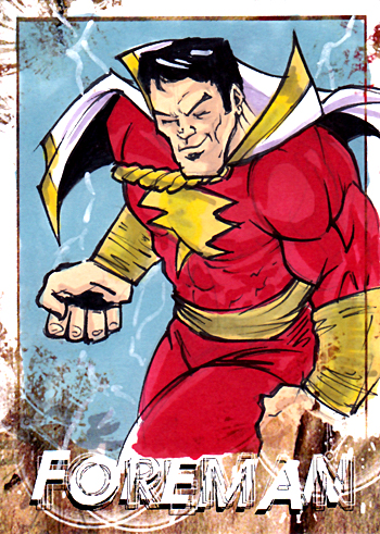
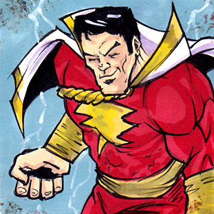
Here is the super cool sketch card of Captain Marvel by Chris Foreman. My girlfriend bought me this commission sketch card. Foreman created it on the spot.
It was really awesome to see him create this piece. He started with a quick sketch, then inked it, then colored it, added some shadows and highlights, then inked it again. I was totally blown away!
Thanks to my super cool girlfriend for this super awesome gift.
– SHAZAM!
This blog post was originally published on my former website, Comic Book Graphic Design and has now been migrated here to RSC Arts, Artist Blog.
A few days ago my girlfriend was cleaning one of my old portfolio cases. I told her she could use it for a collections class she is taking this semester. As she was taking out my old work that was still in the portfolio case she noticed there were some ads I created for my old comic book shop “Modern Age Comics”. I had created them a few years back and I had totally forgotten that they were in there. They were actually pretty good and I’m kinda proud of them. So I’ve decided to post them in this blog as a walk down memory lane and to showcase some of my old comic shop work.
This black and white flyer is actually the very first flyer I created for my store. I created it in Adobe Illustrator and Photoshop. The images are halftone dots. I have always been very fond of using halftone dots. I remember making hundreds of xerox copies of this flyer and plastering them all over town and the university which was across the street from the shop. I had a lot of fun with this flyer. I remember choosing the image of Catwoman for this flyer because she had a great pose and I choose Goku from Dragon Ball Z because he was in a very dynamic shot.
This second flyer is actually the back of a magazine named the “Green Frog”. This is from the very first issue of this NMSU student-created magazine. I was approached by the magazine’s editor-in-chief who was also the marketing director. I wanted to make this ad a little more youthful and found a great image of Marvel Girl and Spider-Man in more updated costumes. This was a full-color ad and I used a red header that complemented the red in Spider-Man’s costume. I liked the targeting image I choose with the anime character too. This was a fun ad to create.
This blog post was originally published on my former website, Comic Book Graphic Design and has now been migrated here to RSC Arts, Artist Blog.