Comic Book Digital Inking Techniques with Illustrator Vector Anchor Points

Points & Paths: Example 1

Digital Inking with Illustrator Vector Anchor Points

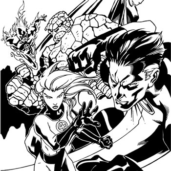
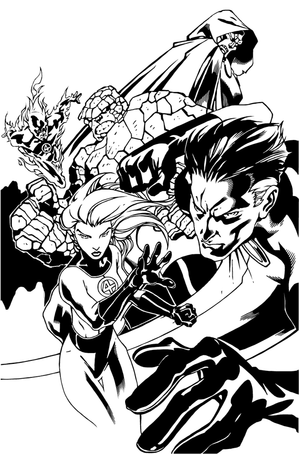
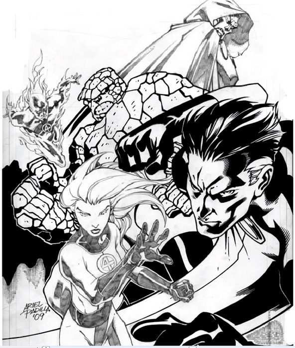
I’ve received several requests to show the steps I used to create my digital inking of the Fantastic Four pin-up I did of artist Ariel Padilla’s pencils.  I was looking for some art to ink and found the pencils on his DeviantArt page. This was a practice exercise I gave myself in the inking process of comic book art using Adobe Illustrator. I’ve been a graphic designer for over 9 years but this was the first time I used my design knowledge for comic book inking.

For this self-assignment, I decided to use Adobe Illustrator for inking the pin-up. I had used photoshop for a previous piece earlier I did of Batman 2.0, a character redesign. I had fun with that illustration but this time I wanted to do this digital inking in vector format. Why choose vector verse bitmap? Well, a vector image is made up of anchor points that are connected by paths (lines) that connect them. A vector image can be re-sized without loss of quality to the illustration. So basically you can re-size the image as small or as large as you’d like without pixelation, it will keep its sharpness no matter the size.  Which is really neat.
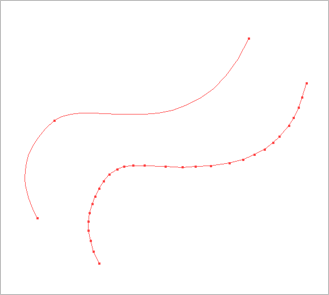
Points & Paths: Example 2

For this illustration, I choose to use my anchor points to create only straight paths (lines). I didn’t use any curved lines. The cool thing about using anchor points and paths is that you can make curved paths, resulting in fewer points This is shown in Points & Paths: Example 2. So why didn’t I use curve paths? Well, honestly it was a self-exercise to see if I could do it. I wanted to create curved lines through straight lines. I found it to be a fun challenge.

I did not create lines or outlines of the original pencils. What I did was look at each line as a shape. I could have easily used the brush tool in Illustrator, but I found I actually had more control over what I wanted to achieve by using the pen tool.
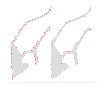
Points & Paths: Example 3

With the technique, I like to use anchor points and paths I am able to get a type of jagged smooth shape. The strength of anchor points is you can use as many or as few points as you’d like to create your lines or shapes. I’ve illustrated this in Points & Paths: Example 3.
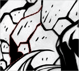
Points & Paths: Example 4

After I created the shape from the pencils, I colored it in black. I’ve shown this in Points & Paths: Example 4. As you can see it’s a piece of a puzzle that makes up the inking. These shapes help to create the feel I was looking for when digitally inking this drawing. This technique really works well when inking the Thing’s rocky skin.
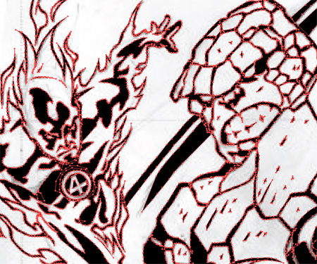
Points & Paths: Example 5

I have included more examples of the anchor points and paths technique I use in inking these pencils. In Points & Paths: Example 5, we see how the wavy fire on Human Torch can be created without using curved lines. Every anchor point in the flames helps to create the illusion of line weight, depth, and movement.
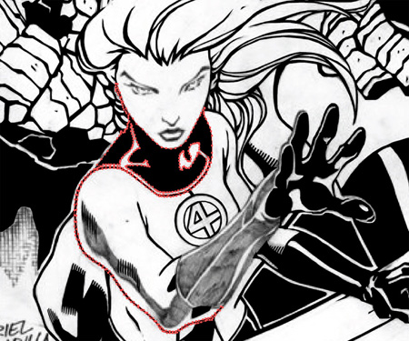
Points & Paths: Example 6

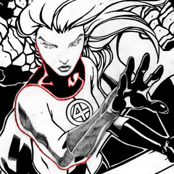
In Points & Paths: Example 6, I’ve shown how I created what looks to be a line on the Invisible Woman’s arm. It is actually a curved shape created with paths. It is a shape that includes the bottom line of her arm and the shadows around her neck. You can see her hands and the background is already colored in.

Although this technique might not seem to be the most efficient, it allows for a lot of control. Looking at each line as a shape helped me to create a type of line work I would not have achieved otherwise.
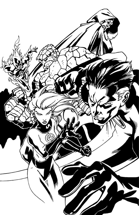
This was my first comic book digital inking using Adobe Illustrator with the anchor points and paths technique. I have done a few more since this one. Although I have used curved lines in those illustrations. This was a fun self-exercise in learning to digitally ink the work of someone else. I am very happy with the way this illustration came out, and I’ll continue to use Adobe Illustrator to digitally ink comic book pencils.

This blog post was originally published on my former website, Comic Book Graphic Design and has now been migrated here to RSC Arts, Artist Blog.
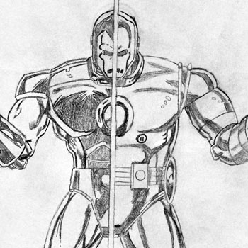
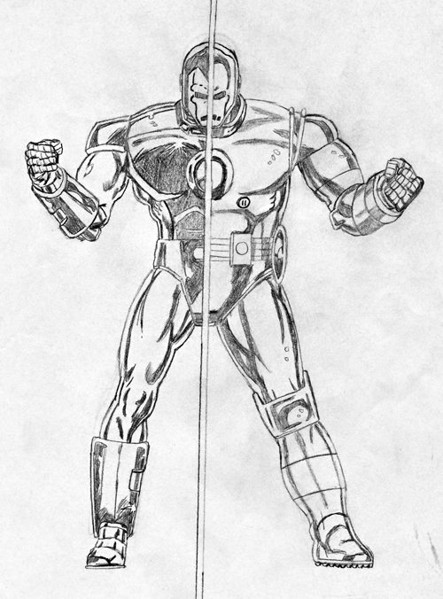
Iron Man – "Present Past" Drawing I did in 1989

Iron Man drawing by Ralph Contreras

Iron Man – “Present Past” Drawing I did in 1989

A few months ago I was vising my mom’s house where I found a box of old drawings I did when I was a kid. There were drawings I did of Veritech fighters from Robotech to comic books and superheroes. Last night I was looking through these treasures from my childhood. I had a blast remembering how I’d stay up late, looking at my comics and wanting to create and recreate these awesome artworks. One of the drawings that jumped out to me last night was this one of Iron Man. I drew this 20 years ago in 1989 when I was 14 years old.

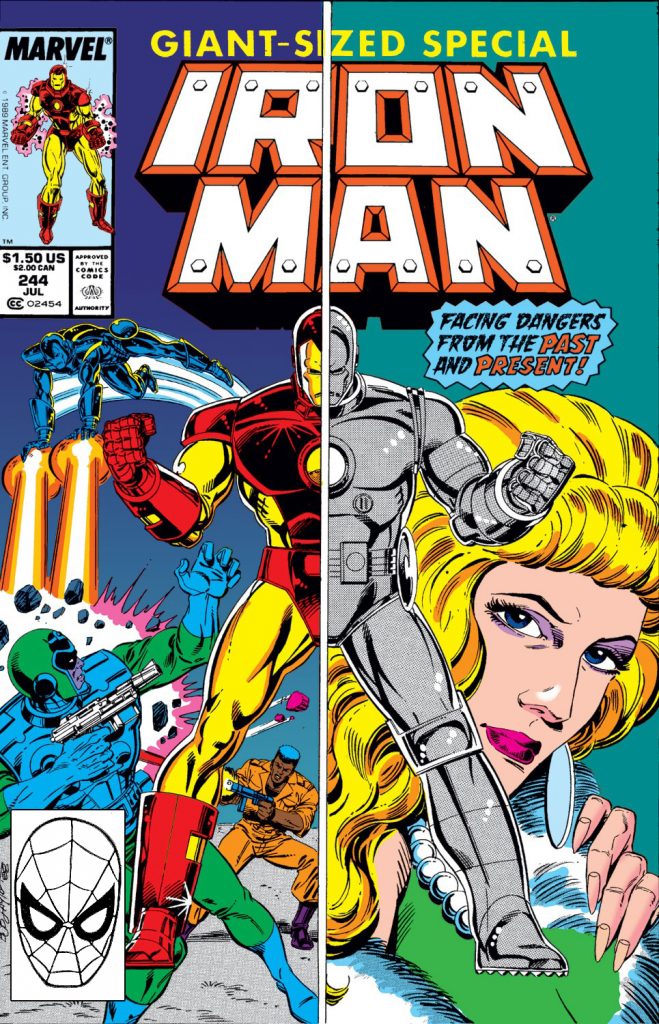
In the late 80s I was reading all the Marvel Comic I could get my hands on, but Iron Man was on the top of my favorites list. I’m a huge science fiction fan and Iron Man was a perfect meld of Sci-Fi and Comics. This drawing was a recreation of the cover of Iron Man 244, it was originally drawn by Bob Layton. I remember being blown away by the split screen showing Iron Man’s then-current suit and his original grey one. I had to redraw it. So this is not a tracing, but a recreation of a cool comic cover. This is how I learned to draw. I’d look at a comic and try to recreate it. I didn’t take any art classes when I was young, but I loved to draw.

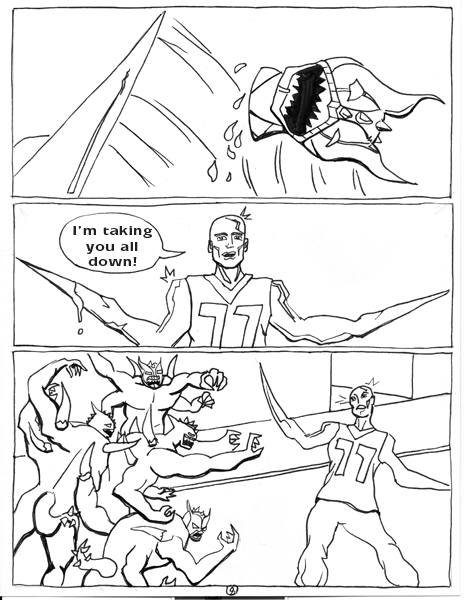
Looking at this drawing I did as a bright-eyed kid so many years ago really reminded me of the passion I had for comic book art back then. I feel very lucky that as an adult I haven’t lost that passion. I plan on posting more of my childhood drawing up, so keep an eye out. -PoW, Zap, Zooom! 

This blog post was originally published on my former website, Comic Book Graphic Design and has now been migrated here to RSC Arts, Artist Blog.
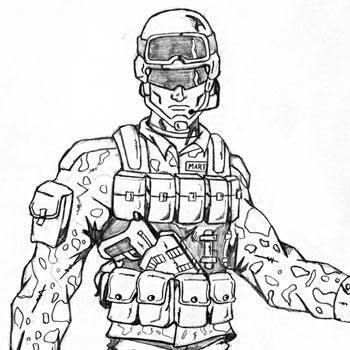
Dark New World Zombie Comic Book – Character Sketches of Andrew Martinez

Andrew Martinez character design by Ralph Contreras

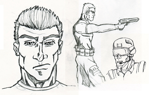
Character Sketches of Andrew Martinez

I am currently working on the comic book “Dark New World” with Carlos Parra. It’s a continuation of his independent zombie film. He’s introducing a lot of new characters into this awesome zombie-infested comic world.

Here are the initial Character Sketches for Private Andrew Martinez, one of the new characters from the mind of Carlos Parra. The character is a veteran of the recent Iraq war. He uses the skills and training he received from the armed forces to survive this Dark New World.

Andrew Martinez design sketches

With these character design sketches, I took into consideration Martinez’s military knowledge. Carlos sent me several photos of soldiers in uniform for the general look he wanted for Martinez. I used these references and modified them a bit to come up with his look while still keeping to the standard U.S. Army desert uniform. He’s in 30’s so I tried to show that in these sketches. He doesn’t look too old or too young.

This blog post was originally published on my former website, Comic Book Graphic Design and has now been migrated here to RSC Arts, Artist Blog.
The Movies, Games, and Comics Panel at the Albuquerque Film Festival 2009

Movies, Games, and Comics Panel

I was very fortunate to be able to attend the “MOVIES, GAMES, AND COMICS PANEL” this weekend at the Albuquerque Film Festival 2009. The speakers on the panel were T.Q. Jefferson: the Marvel Comics Director of Games, the Eisner-nominated Pander Brothers: Jacob and Arnold Pander, and a writer/director from Rogue Taurus Productions. It was a great relaxed panel where they told us about how they work with the story, licensing, and marketing of their projects.

T.Q. Jefferson from Marvel Comics showed us a trailer for the new Iron Man 2 video game, which by the way rocked! He also showed some awesome character design concept art for Iron Man and Crimson Dynamo. He explained how the video game and the movie are both coming from the same place, but can still stand equally on their own. The story in the game is not a retelling of the new movie, but just a new adventure with the same characters and spirit from the movie. The game has been in development for over a year now, so the creators know the general idea of the new movie but not the whole story. He hinted that the games for both the Thor and Captain America movies are already in development too.

Tasty Bullet graphic novel trailer

I had missed seeing the Pander Brothers last year when they came to the Santa Fe Film Festival with their award-winning identity theft thriller SELFLESS, so it was a nice surprise to see them on this panel. Jacob and Arnold Pander are both well established comic book, writers and artists. They have worked for both Marvel and  DC, in film, video, animation design, and illustration. Arnold Pander talked to us about his newest project Tasty Bullet, a graphic novel he’s working on with Jonathan Vankin. We got to see a really cool trailer for the graphic novel too. He also explained what type of promotions they have planned to bring readers to the book, including an ARG (Alternate reality game) and the creation of vintage commercials for the tasty drink. The graphic novel will be published by Image Comics.

Rogue Taurus Productions is an independent film company based in Albuquerque, NM. They have created several movies which were filmed in New Mexico. It was interesting to hear the writer/director from Rogue Taurus assess that comics, video games, and movies all come from the same place. The desire to tell a compelling and interesting story. He commented on how the beginning process is similar to each other, but they create completely different storytelling mediums.

This was a great panel and I really had a fun time listening to what they had to say. I learned some new information regarding the creative writing process when it comes to licensing properties. Thanks to the Production Central ABQ for hosting this panel through the Albuquerque Film Festival 2009.

This blog post was originally published on my former website, Comic Book Graphic Design and has now been migrated here to RSC Arts, Artist Blog.
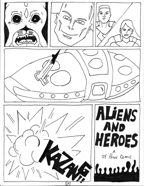
24 Hour Comic 2008 – Santa Fe, NM

24 Hour Comic 2008 – Santa Fe, NM

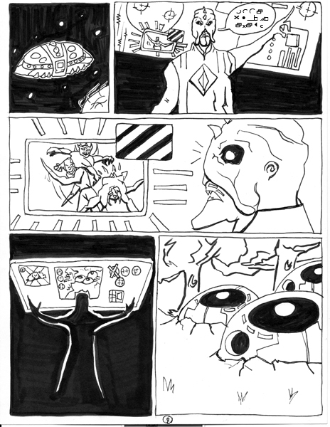
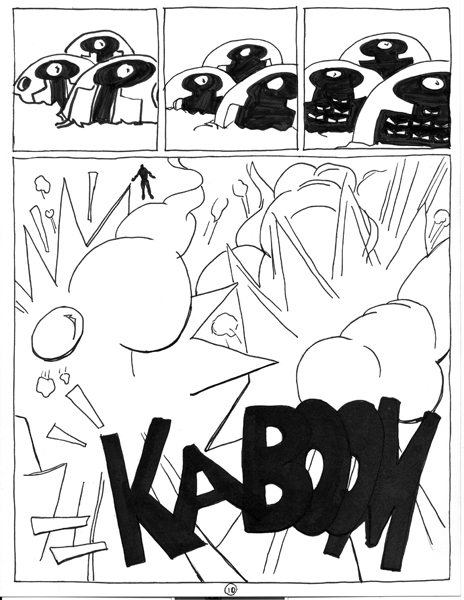
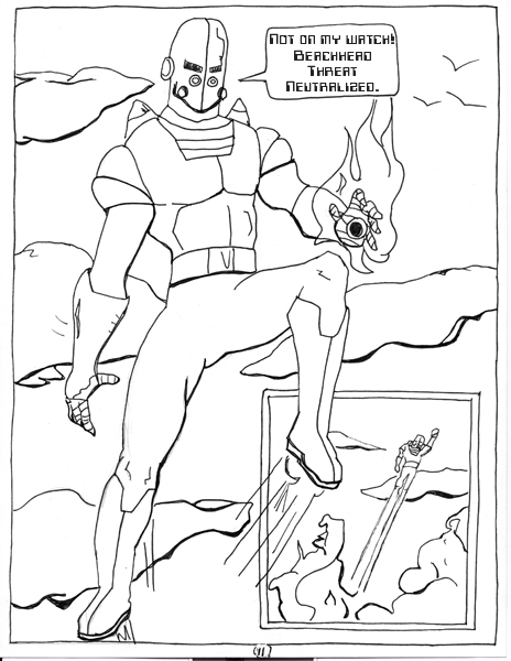
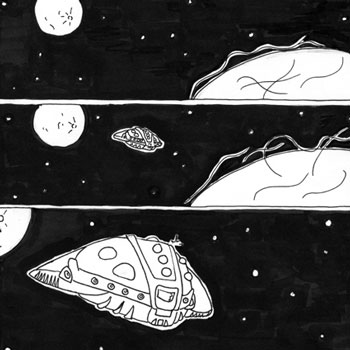
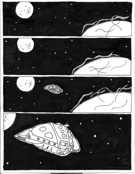
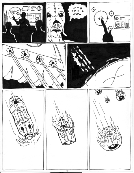
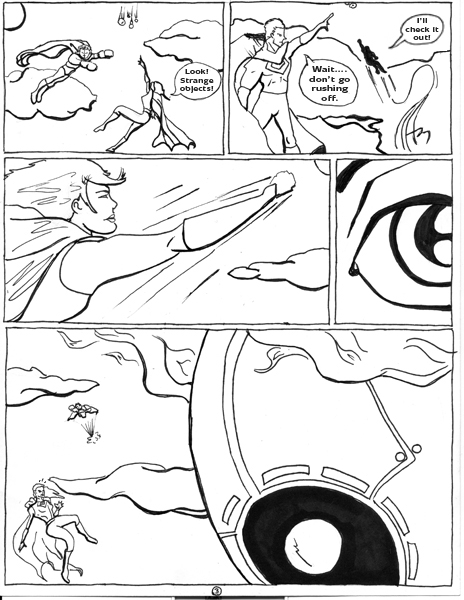
I created this comic book in 23 hours with the help of my girlfriend (she inked the pages) for 24 Hour Comic 2008.

This was the first year I participated in the 24 Comic Book Day. The goal was to create a full 24-page comic book in 24 consecutive hours. It was organized by 7000 BC and True Believers our local comic shop. There were over 20 artists who drew their own comics. We all met at Warehouse 21. A great community center for youth and the arts here in Santa Fe. There was even a small exhibition showcasing the comics we created.

I had a blast doing this and will definitely take part again this year. I can’t wait!

This blog post was originally published on my former website, Comic Book Graphic Design and has now been migrated here to RSC Arts, Artist Blog.

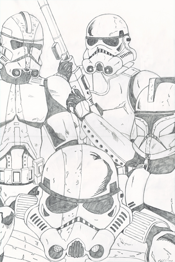
Vader’s Fist – The 501st Legion – Pencil Drawing

501st by Ralph Contreras

The 501st Legion – Pencil Drawing

Here it is….my drawing of Vader’s Fist, the 501st Legion. I started drawing this picture a few weeks ago. I took a week off from drawing it and finished it this weekend. I had a lot of fun with this drawing. I usually draw comic book stuff, but I felt like changing it up. I’ve never really drawn a Stormtrooper from Star Wars before, so I decided to draw a bunch. I choose the 501 because they aren’t just any legion of Stormtroopers. They are the Elite in the Empire and Darth Vader’s personal legion and later Grand Admiral Thrawn’s too. Check out this article at Wookipedia to learn more about them.

This pencil drawing was done on 11″x17″ Bristol board paper. Comic book art paper to be exact. I used an HB woodless pencil to sketch it out, then used an HB mechanical pencil to darken the lines I liked. I used little Xs to show where the solid black area would be. When I finished with the darkening of the final lines,  I used a 4B woodless pencil to fill in the black areas. To see the beginning stages of this drawing check out my blog post ” Star Wars – Vader’s Fist – Beginning Drawing

I’m planning on digitally inking this pencil drawing in illustrator. I like inking digitally with Illustrator because vector images are always perfect no matter how you resize them. I haven’t decided if I’m going to color it in Photoshop or in Illustrator though.

This blog post was originally published on my former website, Comic Book Graphic Design and has now been migrated here to RSC Arts, Artist Blog.
Albuquerque Collectors Con 2009

Albuquerque Collectors Con 2009

This last weekend I drove down to Albuquerque for the Annual Collectors Con. It showcases comic books, anime, and toys. I went last year after moving back to New Mexico from Las Vegas, NV and I had a blast. This year I was excited to see what other cool and fun stuff would be there. The con is sponsored by Lobo comics, a local comic book shop in Albuquerque, NM.

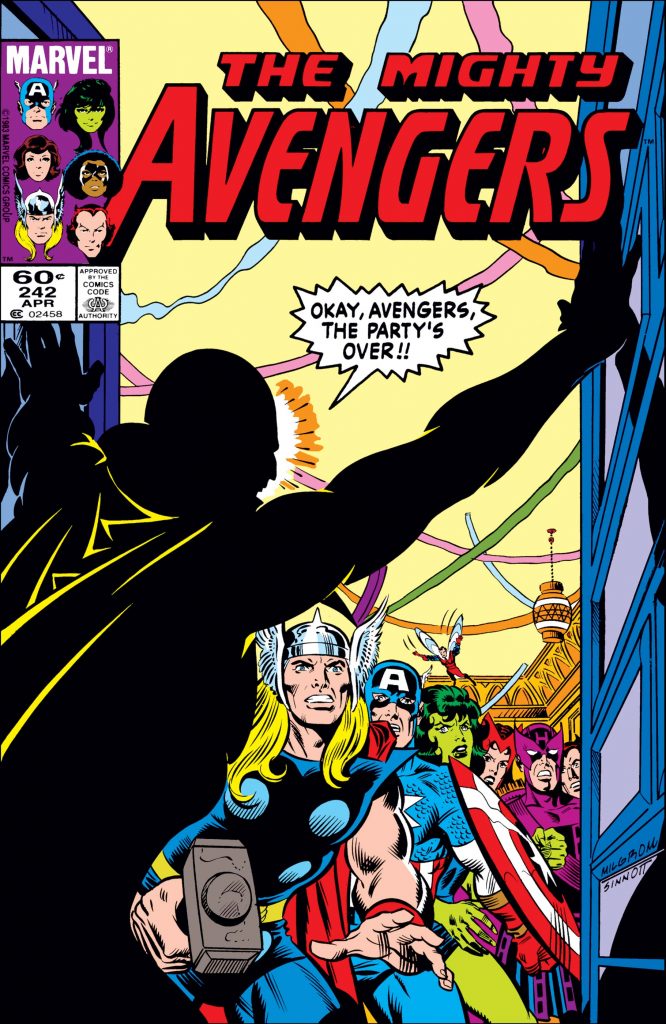
I found a personal treasure this year at one of the booths. The Mighty Avengers issue #242! When I was a kid this was the very first comic book I read. A few years back when I opened my own comic book store, “Modern Age comics” in Las Cruces, NM. I used my personal collection as the starting inventory. I had comics from 17 years of collecting, about 8,500 comics and Avengers 242 was among them. I  remember selling my copy during the first few weeks. I was happy it was sold to a kid who was starting to buy comics for the first time. That was actually really cool. So it was very cool for me to find a copy this weekend. This one will stay in my new collection.

There were a good amount of booths this year, with comics ranging from the Silver Age to current issues. Of course, there were those hard-to-find issues like the Amazing Spider-Man with President Obama in it. There were rows and rows of great comics, toys, and models. There was also a good variety of movie merchandise and collectibles. It was really fun to see a Kryptonian crystal from the newest Superman movie and lifesize green Kryptonite. My favorite collectible I saw at the con was a set of Star War Return of the Jedi glasses from Burger King. I remember having the full set when I was a kid until our dishwasher ate them.

There were some booths with super hard-to-find toys from G.I.Joe, Star Wars, Star Trek, Marvel, and Dc Direct. Some of the older figures were out-of-print originals from the ’80s and ’90s. I’ve never been the biggest toy collector, but I was impressed with all the cool toys at this con. The sculptures on the more modern toys were so good, they look like they could be models and statues. I think the McFarlane Toy line that started out in the 90’s really brought up the bar in toy manufacturing. I found myself wanting to buy every figure there,  so I could take them out of the packaging to play with…I mean put on display. :p

If I hadn’t given myself a $20 limit I think I could have spent my whole paycheck easily. I think I actually spent around $30 bucks though. I was close to my budget. It’s fun to just browse the cool backstock of comics. You never know when you’ll find that issue you’ve been looking for. It’s even more fun to find comics you’ve never heard about. I was able to find some great comics. The Mighty Avengers 242 was the most exciting for me personally, but I also found a whole set of Superman: the Dark Side (an awesome Elseworlds comic where Kal-El lands on Apokolips instead of Earth, he’s not a nice guy in it),  I also bought Ka-Zar #16 for a buck. It’s a fun issue where he fights Klaw.

Comic books and toys weren’t the only things to see at this con, there was an “artist alley” of sorts too. It was really cool to meet people that not only like comics but like them so much they create them too. Andy Kuhn who draws Firebreather from Image comics was there. He lives and works out of Albuquerque, NM. His stuff is fun and very dynamic. Next to him were the guys from 7000 BC, a locally run comic book organization for independent comics in New Mexico. These guys are very cool,  Paul Ziomek and his brother Peter Ziomek who were both at the con representing 7,000 BC. The group also teaches classes to kids showing them that anyone can have fun creating comics. Their booth at the Collectors Con showcased the great work of different styles the group puts out.

I had a blast at this year’s Albuquerque Collectors Con. I will be planning on going again next year. Maybe I’ll take some of the comics I still have from my closed shop or maybe I’ll try to get into the “artist alley” with my own comic book.  Right on to everyone that was there and to all my fellow comic nerds! SHAZAM!!

This blog post was originally published on my former website, Comic Book Graphic Design and has now been migrated here to RSC Arts, Artist Blog.
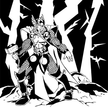
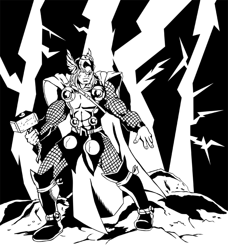
Thor Digitally Inked in Adobe Illustrator

Thor digital inking by Ralph Contreras

Thor Digitally Inked in Adobe Illustrator

Here are my digital inks of Thor, the God of Thunder. He’s one of  Marvel Comics’ main characters. A founding member of the Avengers and actually in the very first comic book I ever read. This is the new costume he’s wearing in his new monthly title.

This was a pencil drawing of Thor I did last week. It was a quick drawing using an HB woodless Ebony pencil.  I traditionally use an H6 pencil for light-tight penciling. For this, I actually was able to achieve good detail with the softer lead. It’s good to get out of your comfort zone and try different drawing tools.

I inked this drawing digitally using Adobe Illustrator. I didn’t do it in one sitting. I took my time and did it in small spurts during the week. (Usually watching a Netflix movie on the side). I’ve only just recently started inking my drawings on the computer, which is ironic because being a Graphic Designer for over 10 years you’d think I would have done it years ago.

I like using Adobe Illustrator for inking, I know a lot of people use photoshop which is a great software too. The reason I use illustrator is that I like saving my inks as a vector images. Vector images are great because there are no worries about pixelation. They are always super high resolution even if it’s reduced or enlarged.

For this inking, I only used the pen tool with my mouse or Wacom tablet. It helps to give me the look I want to achieve. I like the sharp edges and thick to-thin lines I get with it. There’s an amount of control I feel I have with the pen tool. I think in my next digital inking I will use only the bush tool. Like I said earlier it’s always good to try different tools. I plan on coloring these inks in the near future using Photoshop.

This blog post was originally published on my former website, Comic Book Graphic Design and has now been migrated here to RSC Arts, Artist Blog.
My Introduction to the World of Comic Books

Comic books have always seemed to be an important part of my life in one form or the other. I’ve been a fan of the stories, the rich character development, and histories, of course, the artwork, a hardcore collector, and I even owned and ran my own comic shop for years. My all-time dream is to be able to create my own comic book or be involved in the creative part of the industry. I am in the process of achieving that dream, and with hard work and determination I know I’ll reach my dream.

When looking back at my love affair with the comic book genre I realized that I actually remember the very first comic book I read. This was 25 years ago and I was like 9 years old. I didn’t go to any comic shops and I wasn’t actively looking for a comic book. I was just at home being a nerdy kid playing with my Star Wars toys. My aunt Ruth came over to my house for a visit. She handed me a stack of comics. They were taken from her husband who was a comic book collector. She was clearing out space at her home and thought I might like them. I had never really been interested in comic books before, sure I had watched Spider-Man and his Amazing Friends as well as the Super Friends cartoon. So I knew about superheroes, but this was my first introduction to the amazing world of comic (sequential) storytelling.

My Introduction to the World of Comic Books

The very first comic I read from the stack of comics she gave me was The Mighty Avengers 242. So this is officially the first comic book I ever read.

I remember the cover caught my eye because I wanted to know who the shadow figure was and why everyone looked so shocked. What I also remember most about this issue was the introduction of Mockingbird by Hawkeye to the Avengers. It was a good introduction issue for a new reader like myself.

There wasn’t really a lot of action in this issue, but there was a compelling story. The comic showed me how this group was friends and close like family. This can only really be shown in a long-running story. So I wanted to know more about these characters.

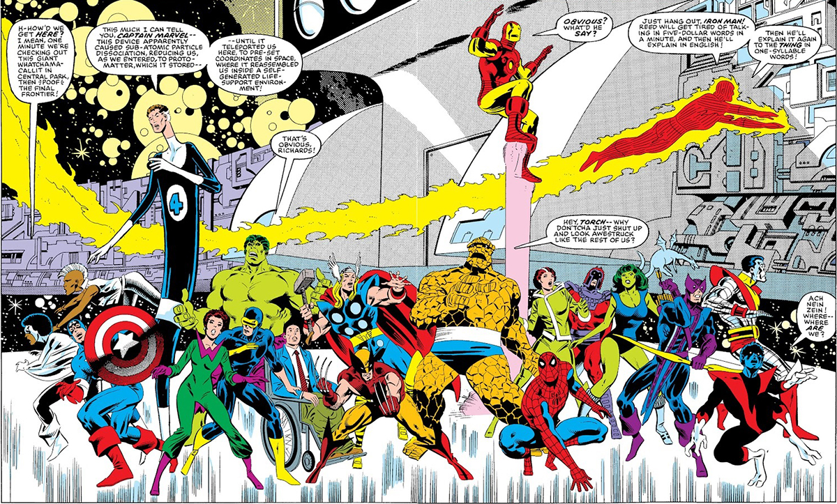
It ends with Captain America, Wasp, She-Hulk, Thor, Captain Marvel, and Hawkeye heading to a strange structure in Central Park New York, and getting zapped away. As a kid I didn’t know what was happening, did they die or what?

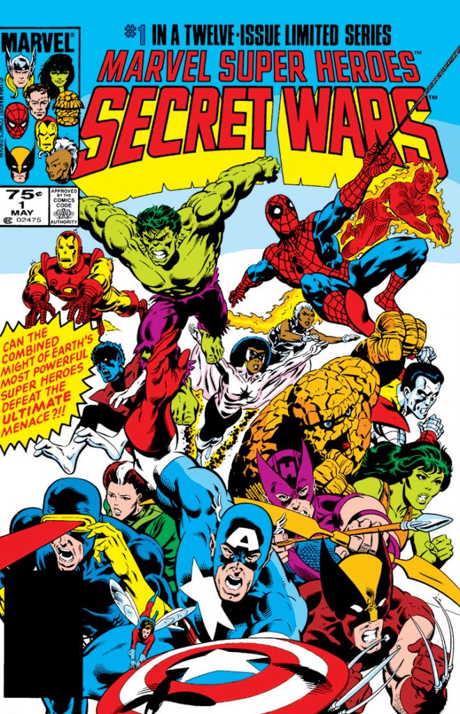
The next comic book I read was Marvel Super Heroes Secret Wars 1. With a great cover like that, you’d think it would’ve been the first one, I’d read. It’s actually my good fortune that I  read this comic next. Avengers 242 leads right into this one. You can imagine my pleasant surprise to discover the Avengers didn’t die but were instead transported to an arena with a lot of other superheroes.

Again being that this was my first time reading comic books it was great to start with this issue too.  It introduced me to all the major characters (heroes and villains) in the Marvel Comics universe. With a quick synopsis of who they were and what they were all about.

The premise of Secret Wars was that of a super cosmic being named the Beyonder and how he gathered Earth’s greatest heroes and villains to basically fight to the death. The winner would receive their heart’s desire. I remember how Galactus flies to attack the entity and is swapped like an insect. As a 9-year-old kid, this just blew me away.

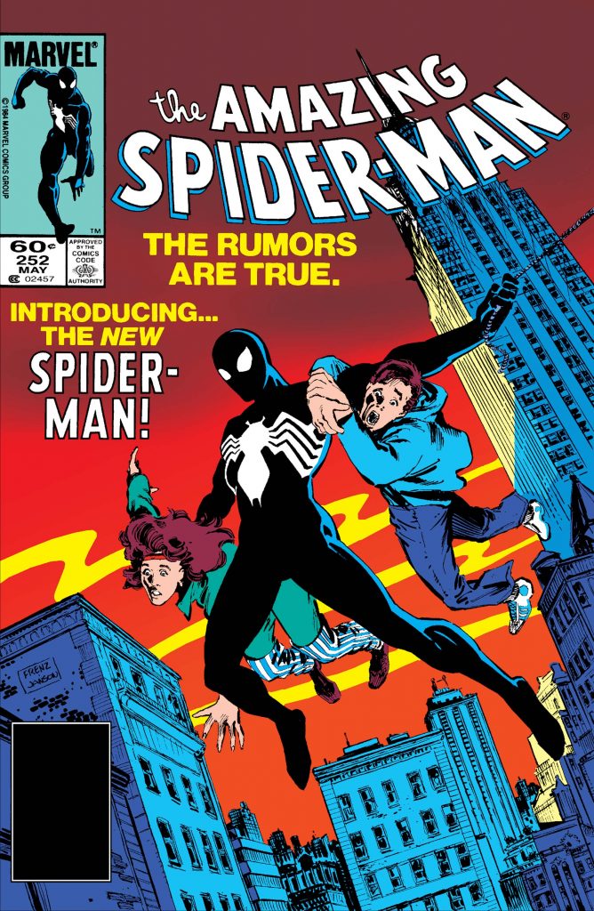
The third comic I read was probably the most famous of the lot. Amazing Spider-Man 252. As most people know (well at least the one’s in comic book circles) this is the first appearance of Spider-Man’s black suit. Which we later learn is actually an alien Symbiote life form. Years later the suit eventually becomes one of Spider-Man’s deadliest villains named Venom.

I was familiar with Spider-Man from his Saturday morning cartoon series on tv, but this Spider-Man was very different. This Peter Parker was much grittier. He wasn’t as go-lucky as I had known him from the cartoon.  With the addition of this black suit, the charter just seemed darker to me.

I remember the first page of the comic shows the Daily Bugle with the headline about missing superheroes. This issue takes place after the event of Marvel Super Heroes Secret Wars. So I was excited to know that Spider-Man would survive the Secret War. This was the first Spider-Man comic I had ever read and I was very intrigued by how different it was, I was super excited to read more.

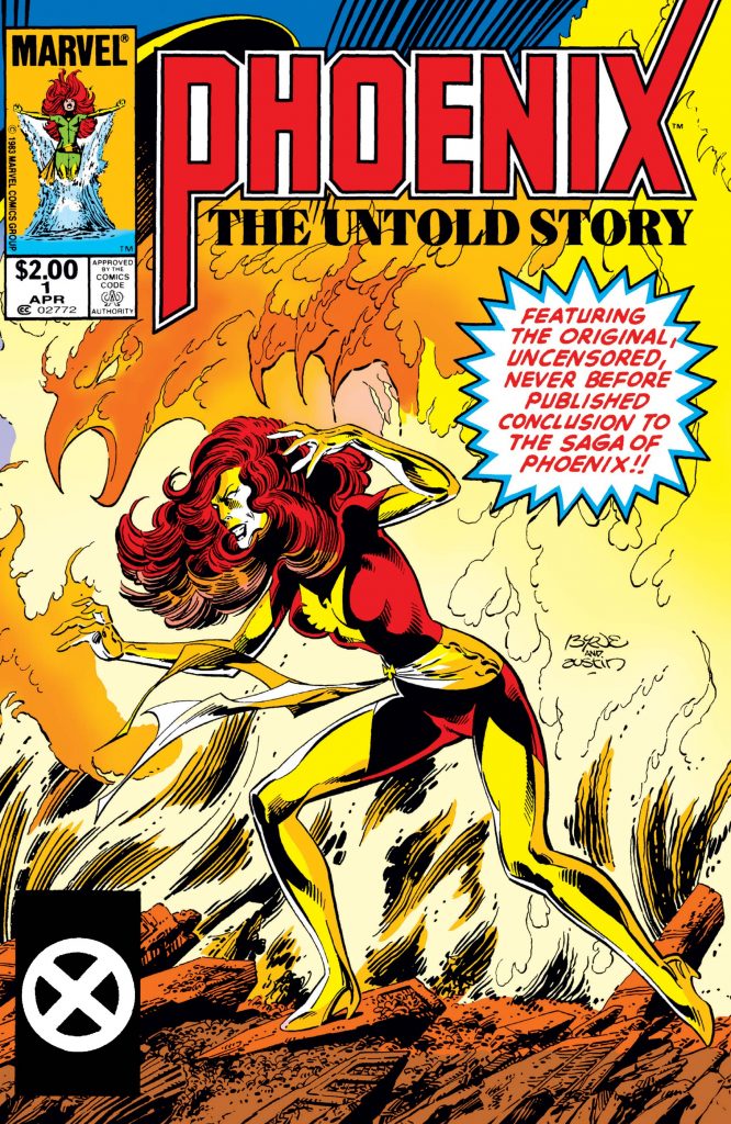
The final comic in the group my aunt gave me was the one that showed me the depth of storytelling and character development that could be found in comic books. Sure I was only a kid but the story really blew me away and I knew this was something special. The comic was Phoenix the Untold Story and my introduction to the world of mutants and the X-Men.

This story is a reprint of Uncanny X-Men 137 with the original attended ending. It takes place after the Dark Phoenix Saga and is where Jen Grey is judged for her crimes as Phoenix. Like the Avengers comic I read, this group of heroes were more than just teammates, they were a family.

This comic book takes us through the minds of all the heroes, showing their hopes and dreams. It shows the love that Jean and Scott have for each other and the pain her loss will bring to the whole group. The X-Men fight against aliens with their own powers for Jean’s life. In the end, she sacrifice’s herself before the darkness that was Phoenix could return to harm her friends.

As I look back at these first comic books I read, I fully realized how lucky I was. These were groundbreaking stories and a great way to start my life as a comic book reader. I had no knowledge that comic book stores existed back then so every time my parents would put gas I’d look for the comic section. I didn’t care if the comics were bent (which they usually were) I was just excited to see what cool new stuff was out. I remember there was a gas station named the Good Time Store and its logo was a big smiley face. That’s where I always found the latest issues of Secret Wars.

It’s been a great 25 years of comic reading. There have been so many great story arcs and a few not so good, but it’s always been a huge pleasure. These stories have had the greatest visuals imaginable and anything is possible. I’ve read all the great character development through the hero’s adventures and tragedies. Although I started as a Marvel Comics fan I now read other comic companies like DC, Dark Horse, and so many Independent comics. I know that for the next 25 years and most likely the rest of my life I will enjoy reading comic books. They are our modern mythology and I thank my Aunt Ruth for introducing them to me.

This blog post was originally published on my former website, Comic Book Graphic Design and has now been migrated here to RSC Arts, Artist Blog.
Comic Book Digital Inking with Adobe Illustrator

Fantastic Four digitally inked by Ralph Contreras

Comic Book Digital Inking with Adobe Illustrator

Here is a digitally inked Pinup of an awesome penciled piece of the Fantastic Four by artist Ariel Padilla. I found the pencils on his DeviantArt page and I knew I had to ink it. I used Adobe Illustrator so I could create a vector image. This way it can be reduced or enlarged with no pixelation of the image. This is actually my second piece digitally inked but the first I’ve done in Illustrator. My Batman 2.0 character redesign was my first digitally inked piece but for that I used Photoshop. I have used Illustrator in the past to create illustrations, logos, advertisements, and marketing but this was the first time I incorporated my graphic design skills into inking.

I have a Wacom tablet but for this digital inking, I used only my mouse and the pen tool. So basically the piece is all straight vector anchor points. This illustration took about 5 hours, which is longer than I thought it would, but it was fun and a nice practice piece. On my next Illustrator ink, I plan on using the Wacom tablet and the brush tool. Right now it is all about having fun and learning to use the tools I use in my graphic design work in my comic book artwork. My next step will be to create flats for these inks and maybe color them too.

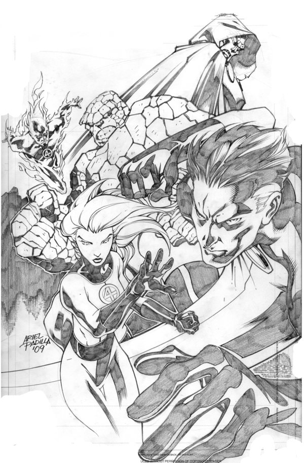
Original Pencils of Fantastic Four by Ariel Padilla

Here are the original pencils by Ariel Padilla.

Want to see the steps I took to create the digital inking? Check out my blog post: Comic Book Digital Inking Techniques with Illustrator Vector Anchor Points

This blog post was originally published on my former website, Comic Book Graphic Design and has now been migrated here to RSC Arts, Artist Blog.
Privacy Policy - Terms and Conditions

Copyright © 2000-2024, All rights reserved unless otherwise noted herein.