Inktober Unleashed: Embracing the Energy of Spontaneous Inking

Bait and Trap ink illustration

The Art of Letting Loose: Finding Inspiration on Inktober day 3

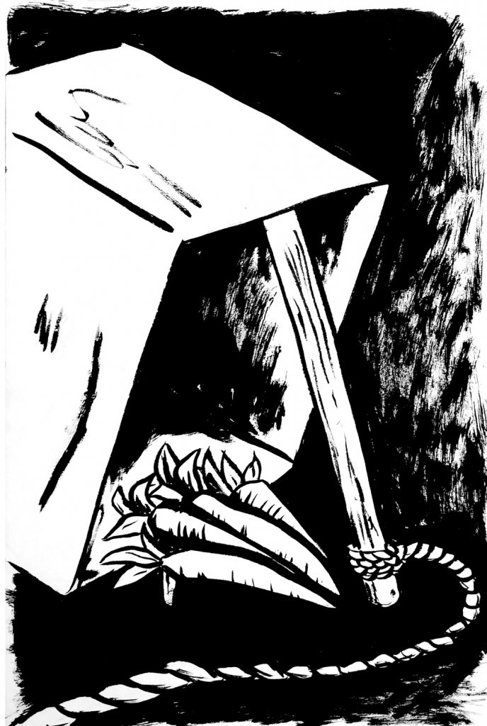
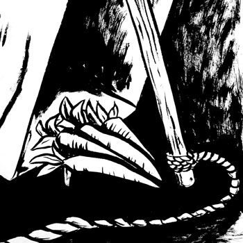
So I really struggled with Inktober’s third day prompt of Bait. I think it actually shows in the inking too. I had no real idea what I wanted to ink. Then it came to me, if there’s bait then that equals a trap. So I illustrated a box trap with a bushel of carrots as the bait.

I went straight into the inking with this illustration, no pencil sketch to start with. I think you can tell with the unevenness of the line work. But I think that really worked for this ink drawing. There’s an energy that I would have lost if I had over worked it. I used a Pentel brush pen and I feel it created really nice organic ink strokes
Driving Toward Danger: Revving Up the Action

Cars Playing Chicken Ink Illustration

Pedal to the Metal: My Inktober Day 5 Illustration

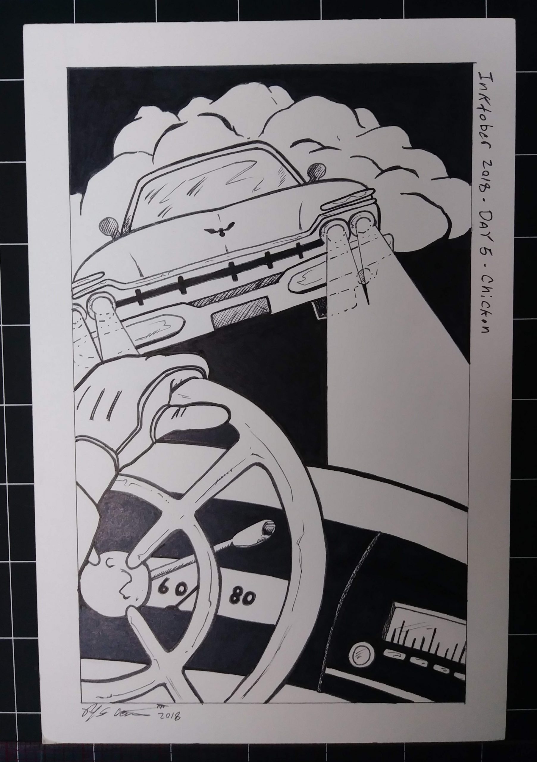
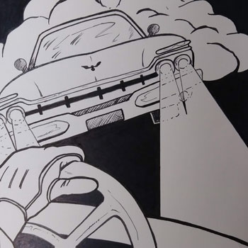
I was excited to tackle the Inktober prompt for Day 5, “Chicken”. Immediately, I thought of creating a high-action scene with two cars driving at each other, and I was thrilled to bring this concept to life.

For this illustration, I wanted to focus on creating a strong composition beyond simply drawing a figure. To achieve this, I decided to draw the point of view of one of the drivers from inside their car, complete with a gloved hand gripping the steering wheel. The skewed view of the incoming car adds to the sense of fast-paced action, and I even included dust from the second car, complete with a headlight glaring at the oncoming vehicle.

I am very happy with the final result of my ink drawing. I believe that the composition and cars capture nicely the “Chicken” prompt. Overall, this piece was a great opportunity for me to experiment with a new technique and push my artistic boundaries.

The Power of Resistance: Inking for a Revolution

Resist Ink Drawing

Unleashing My Inner Rebel: Inktober Day 4

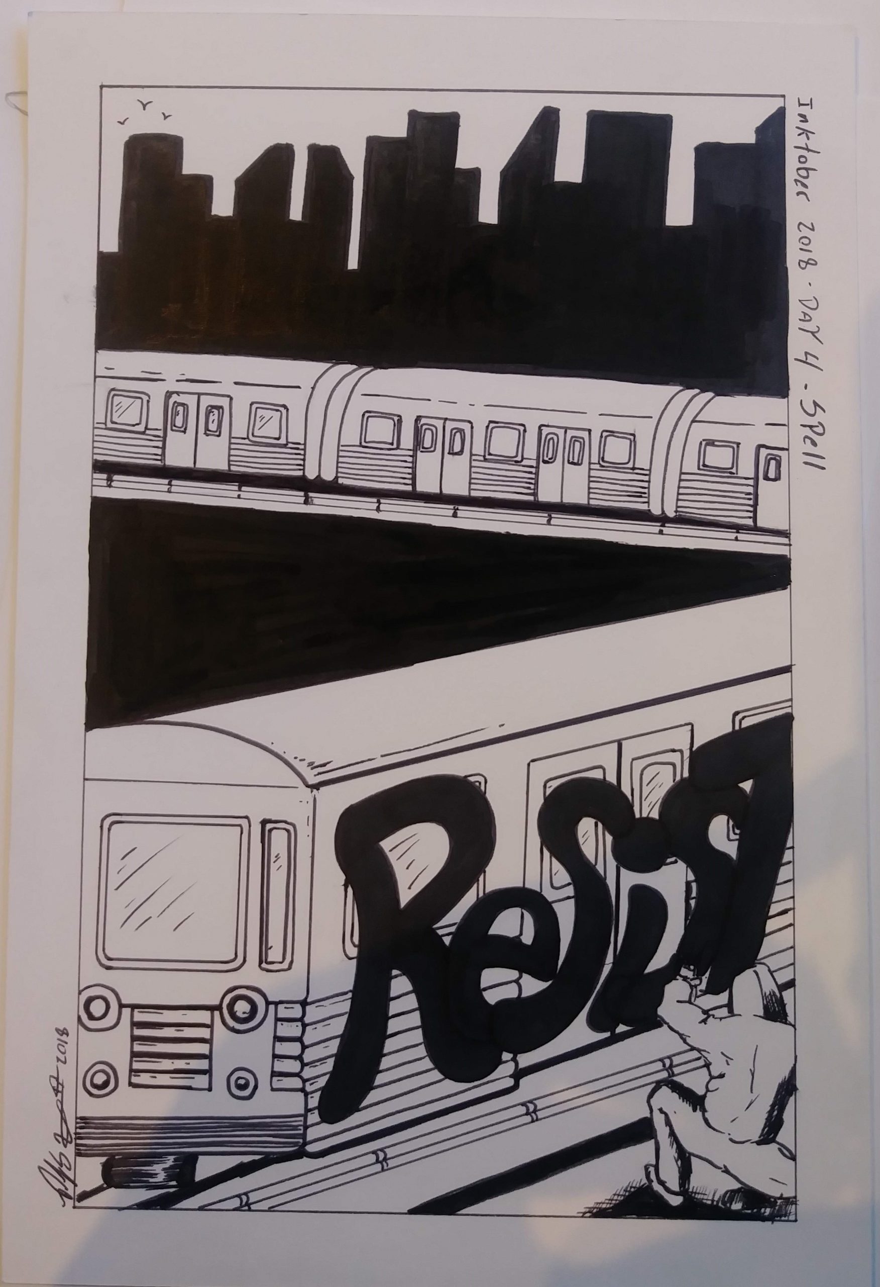
For Inktober Day 4, the prompt word was “Spell”. As part of my challenge to focus on composition this year, I tried to create depth. I used a solid black silhouette of a cityscape in the background. In the foreground, I drew a person spray-painting the word “resist.” I included a train cutting across the panel to further enhance the sense of depth.

I found that using solid black to separate the different sections of the composition worked in creating a cohesive overall image. I decided to use a ruler for this particular piece. It really helped with all the details on the train. Overall, I felt that this illustration was a success, and I enjoyed drawing and inking it.

One personal achievement for me during the creation of this piece was inking it at a Starbucks. I typically do not draw or ink in public, so this was a significant step in pushing myself out of my comfort zone.

Privacy Policy - Terms and Conditions

Copyright © 2000-2024, All rights reserved unless otherwise noted herein.