My Process for Redesigning the Color Scheme of Sylvia Light’s Armor
Last night, I spent some time working on costume redesigns for one of my characters from an upcoming webcomic project. Specifically my main character Sylvia Light, also known as Aurora Light. I was redesigning her basic look.
The idea of Aurora Light came to me a few years back when I was challenged to create a superhero team for The REPLICANTS Project. Sylvia is one of Lilith’s warrior daughters and the greatest warrior in her army.
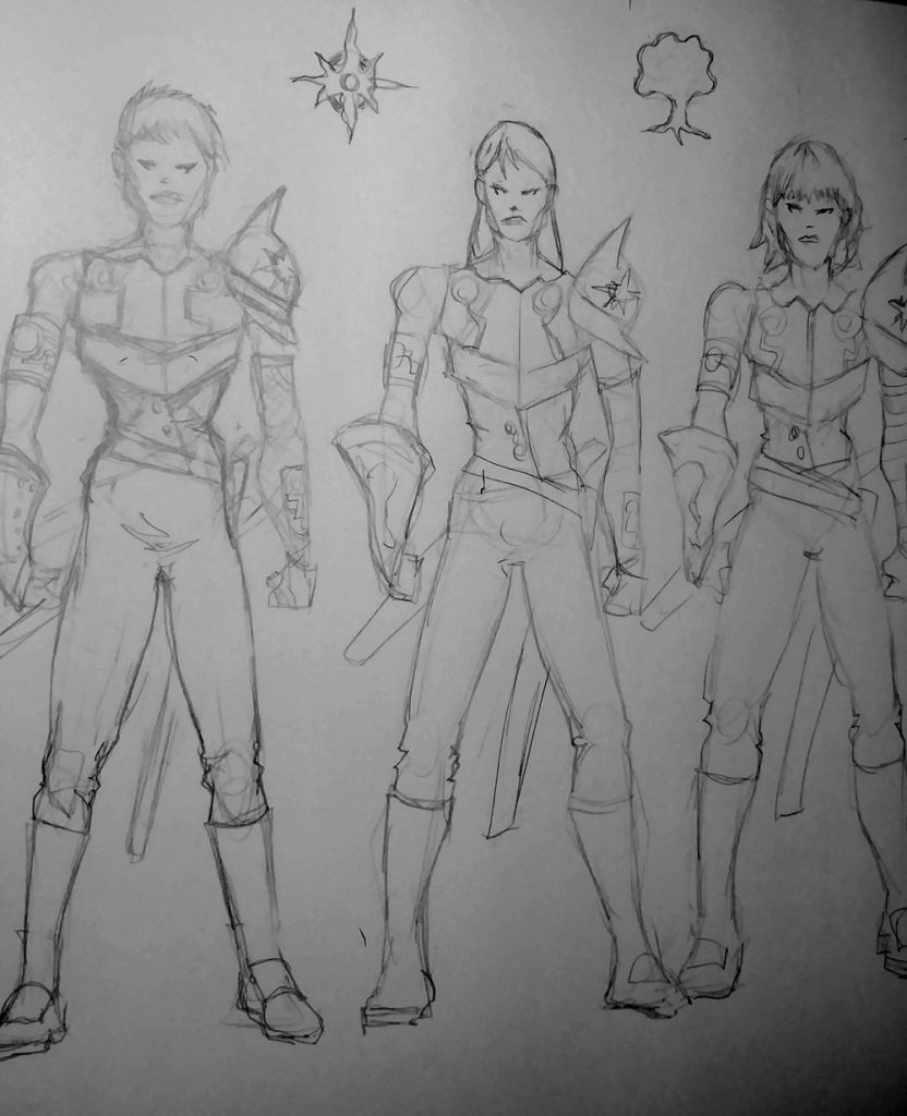
In her original look, Sylvia was a blonde with gold and red armor. Here’s a blog post with her original character design. I wanted to switch things up for her redesign and make her a brunette. Here’s a blog post where I 1st attempted to redesign her look. I also experimented with different hairstyles to see what would work best for her. I drew her three times with small variations in her armor and hairstyles to see what would look best.

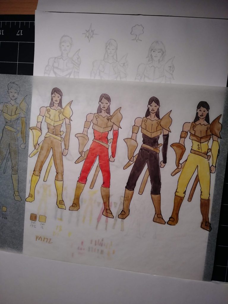
I placed tracing paper on top of the sketches and used markers to come up with different color schemes for her armor. I tried out several color combinations, including yellow and black, gold and yellow, gold and black, and gold and red. This helped me to narrow down my options and find the best color scheme for Sylvia’s new look.
Redesigning Sylvia’s costume was a lot of fun for me. I’m someone who loves world-building and character creation, and working on her costume redesign was fun. I’m happy about the changes I’ve made to Sylvia’s look.
