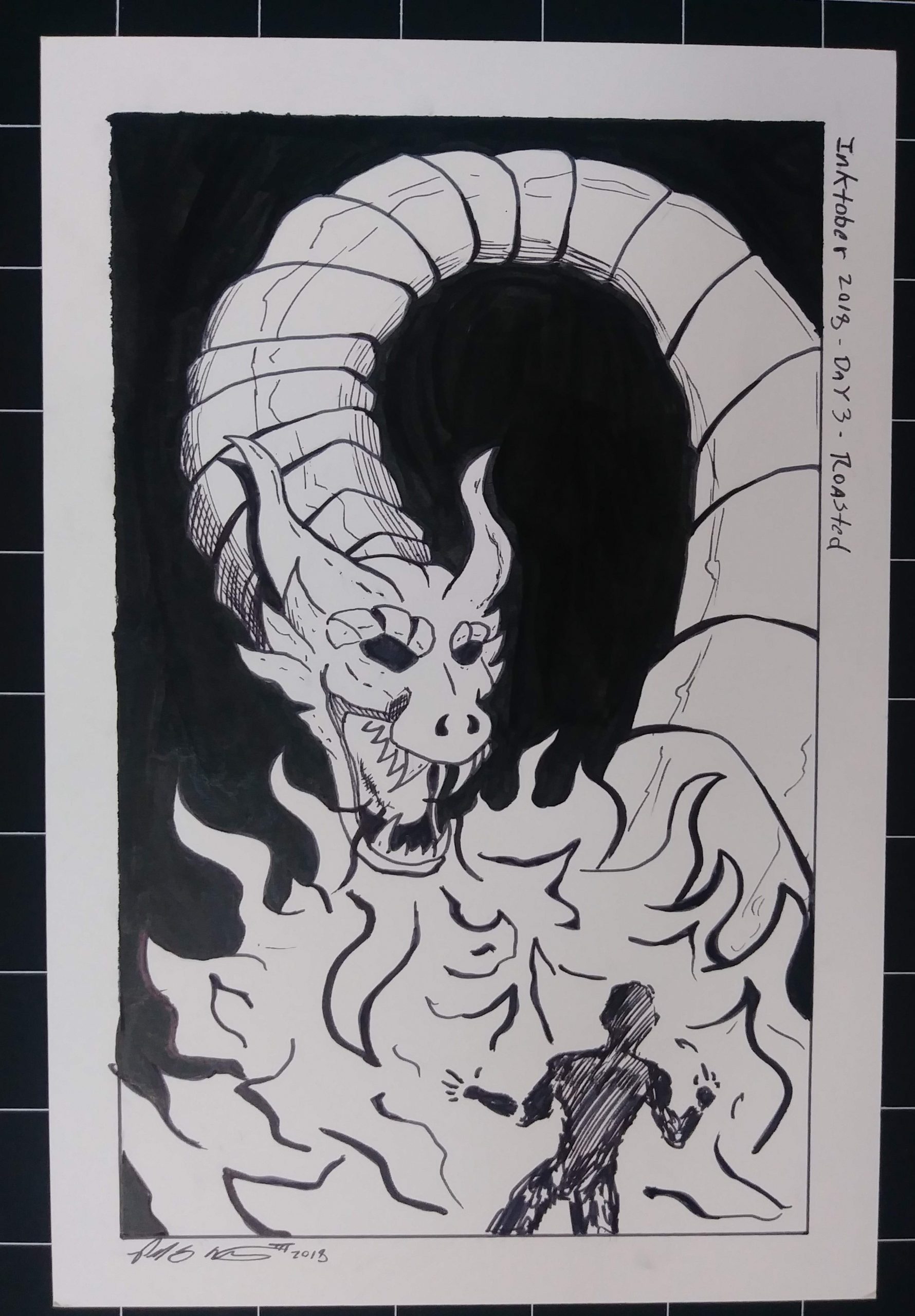
Fire and Fury: A Wurm Style Dragon Illustration

Dragon Ink Drawing

Sizzling Action: My Inktober Day 3 Masterpiece

For Day 3 of Inktober, I decided to have some fun with the prompt “Roasted” and created a piece featuring a wurm style dragon breathing fire and roasting an unfortunate victim. I originally thought about drawing a knight but decided to use a generic character to keep the focus on the dragon and the action.

Since I’m been focusing on composition in my ink illustrations this year, I made a conscious effort to create a piece that would guide the viewer’s eye. The dragon’s looping form helps to draw the eye toward the flames and the roasted character. I also used a solid black background to help make the dragon stand out even more.

As I was working on this illustration, I couldn’t help but notice that the dragon looked like Shenron from Dragon Ball Z. This was probably subconscious because I have been watching Super Dragon Ball recently. Overall, I had a lot of fun with this illustration and felt that it was a success in both the action and composition.
Modern Age Comics Flyer ads

Modern Age Comics Flyer ads

A few days ago my girlfriend was cleaning one of my old portfolio cases. I told her she could use it for a collections class she is taking this semester.  As she was taking out my old work that was still in the portfolio case she noticed there were some ads I created for my old comic book shop “Modern Age Comics”.  I had created them a few years back and I had totally forgotten that they were in there. They were actually pretty good and I’m kinda proud of them. So I’ve decided to post them in this blog as a walk down memory lane and to showcase some of my old comic shop work.

This black and white flyer is actually the very first flyer I created for my store. I created it in Adobe Illustrator and Photoshop. The images are halftone dots. I have always been very fond of using halftone dots. I remember making hundreds of xerox copies of this flyer and plastering them all over town and the university which was across the street from the shop. I had a lot of fun with this flyer. I remember choosing the image of Catwoman for this flyer because she had a great pose and I choose Goku from Dragon Ball Z because he was in a very dynamic shot.

This second flyer is actually the back of a magazine named the “Green Frog”. This is from the very first issue of this NMSU student-created magazine. I was approached by the magazine’s editor-in-chief who was also the marketing director. I wanted to make this ad a little more youthful and found a great image of Marvel Girl and Spider-Man in more updated costumes. This was a full-color ad and I used a red header that complemented the red in Spider-Man’s costume. I liked the targeting image I choose with the anime character too. This was a fun ad to create.

This blog post was originally published on my former website, Comic Book Graphic Design and has now been migrated here to RSC Arts, Artist Blog.

Privacy Policy - Terms and Conditions

Copyright © 2000-2024, All rights reserved unless otherwise noted herein.