Modern Age Comics Flyer ads
A few days ago my girlfriend was cleaning one of my old portfolio cases. I told her she could use it for a collections class she is taking this semester. As she was taking out my old work that was still in the portfolio case she noticed there were some ads I created for my old comic book shop “Modern Age Comics”. I had created them a few years back and I had totally forgotten that they were in there. They were actually pretty good and I’m kinda proud of them. So I’ve decided to post them in this blog as a walk down memory lane and to showcase some of my old comic shop work.
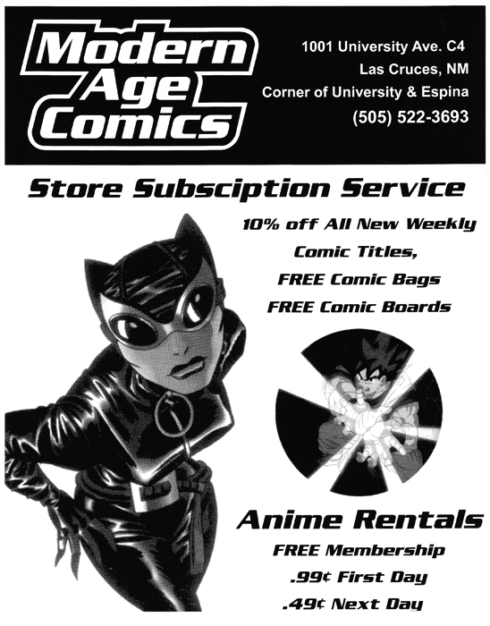
This black and white flyer is actually the very first flyer I created for my store. I created it in Adobe Illustrator and Photoshop. The images are halftone dots. I have always been very fond of using halftone dots. I remember making hundreds of xerox copies of this flyer and plastering them all over town and the university which was across the street from the shop. I had a lot of fun with this flyer. I remember choosing the image of Catwoman for this flyer because she had a great pose and I choose Goku from Dragon Ball Z because he was in a very dynamic shot.

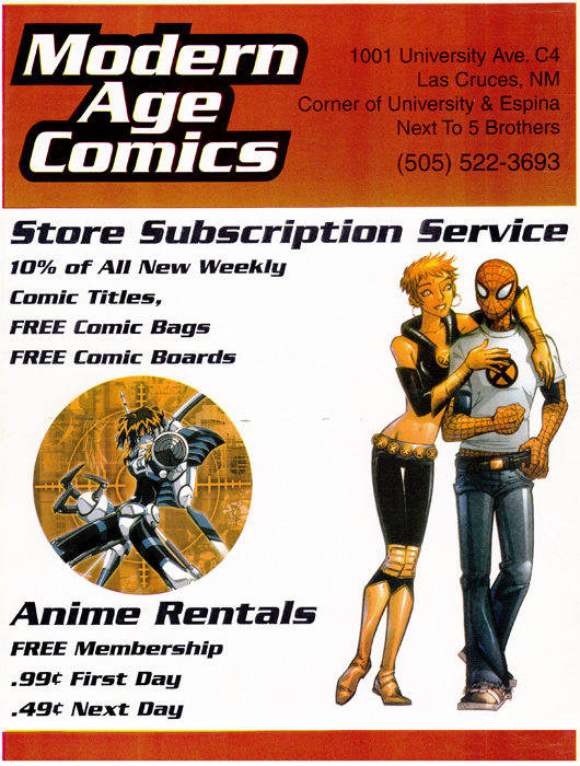
This second flyer is actually the back of a magazine named the “Green Frog”. This is from the very first issue of this NMSU student-created magazine. I was approached by the magazine’s editor-in-chief who was also the marketing director. I wanted to make this ad a little more youthful and found a great image of Marvel Girl and Spider-Man in more updated costumes. This was a full-color ad and I used a red header that complemented the red in Spider-Man’s costume. I liked the targeting image I choose with the anime character too. This was a fun ad to create.
This blog post was originally published on my former website, Comic Book Graphic Design and has now been migrated here to RSC Arts, Artist Blog.
