The Hunter – Character Design – From Sketches to Final Ink – Part 3

Hunter
The Hunter by Ralph Contreras

The Hunter – Character Design – From Sketches to Final Ink – Part 3

A few months ago I was looking through some of my old drawings. Ones I did while I was a kid up to when I was in college. I found my original sketches for a character named “The Hunter”.  I had redesigned his history and biography a few years ago, so I decide to redesign his look too.

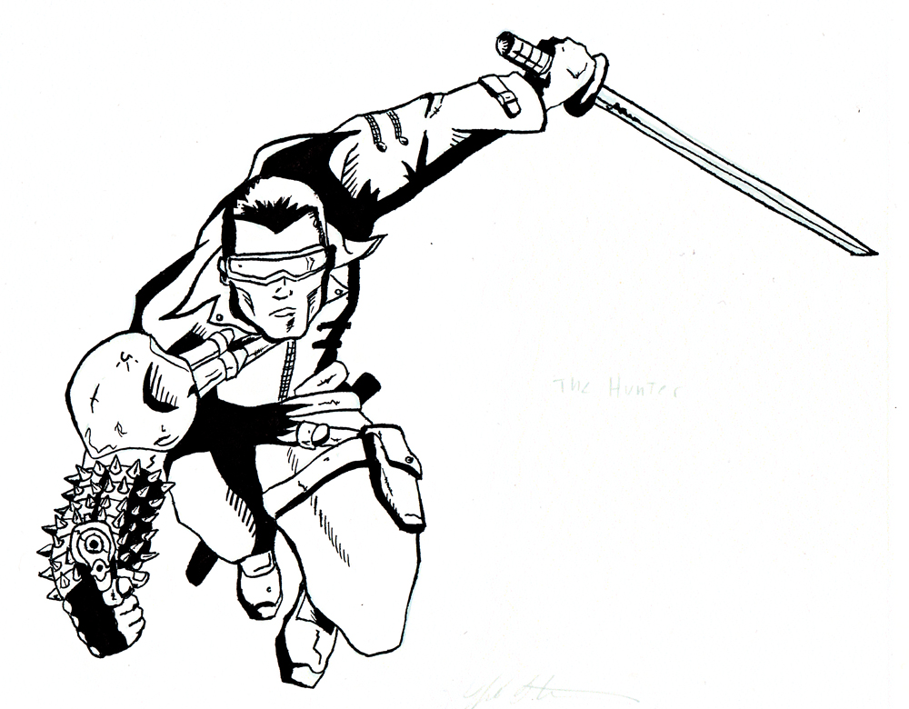
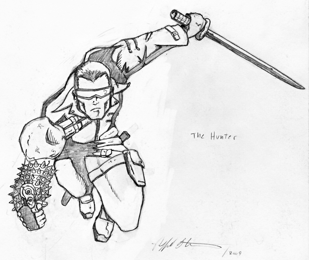
For the past year, I’ve been digitally inking my pencils. I usually use Adobe Illustrator using vector points. I like using the pen tool to create crisp sharp/smooth lines. But for this inking, I wanted to go old school and use a real brush and pen. A process I do not use very often. I had a real blast inking it by hand!I didn’t want to lose my pencils so I scanned the original and reprinted them on card stock. I used Adobe Photoshop to replace the original black lines with blue lines. This way it would be easier for me to ink them.

Here are my final inks of “The Hunter” I had a real blast with this piece. I started with very rough sketches to tight pencils and finally to a finished inked piece. In my next blog post (that’s right I have one more to go) I’ll show you what I did to vectorize my final inks so I can print them at any size without losing the quality of the inks. – Shazam!

This blog post was originally published on my former website, Comic Book Graphic Design and has now been migrated here to RSC Arts, Artist Blog.
The Hunter – Character Design – From Sketches to Final Ink – Part 2

Hunter-Pencils
The Hunter by Ralph Contreras

The Hunter – Character Design – From Sketches to Final Ink – Part 2

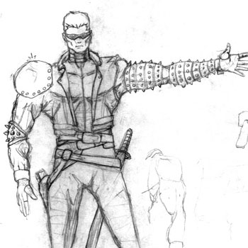
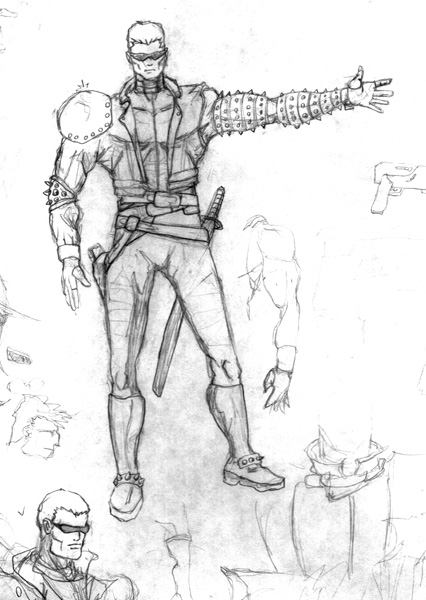
While looking through some of my drawings from ten years ago I found a character design I did for “The Hunter”. From that original sketch, I redesigned his look and biography. The newer design sketches were a little rough, but they were intentionally quick to get my thoughts down on paper.

Once I had the look for The Hunter down, then I could start having fun. I decided to draw him in an action pose, jumping at a target with his gun and sword ready for battle. I tried playing with shadows, perspective, and highlights. I’ve been refining these elements in my drawings. They have been helpful in me finding my own comic book art style.

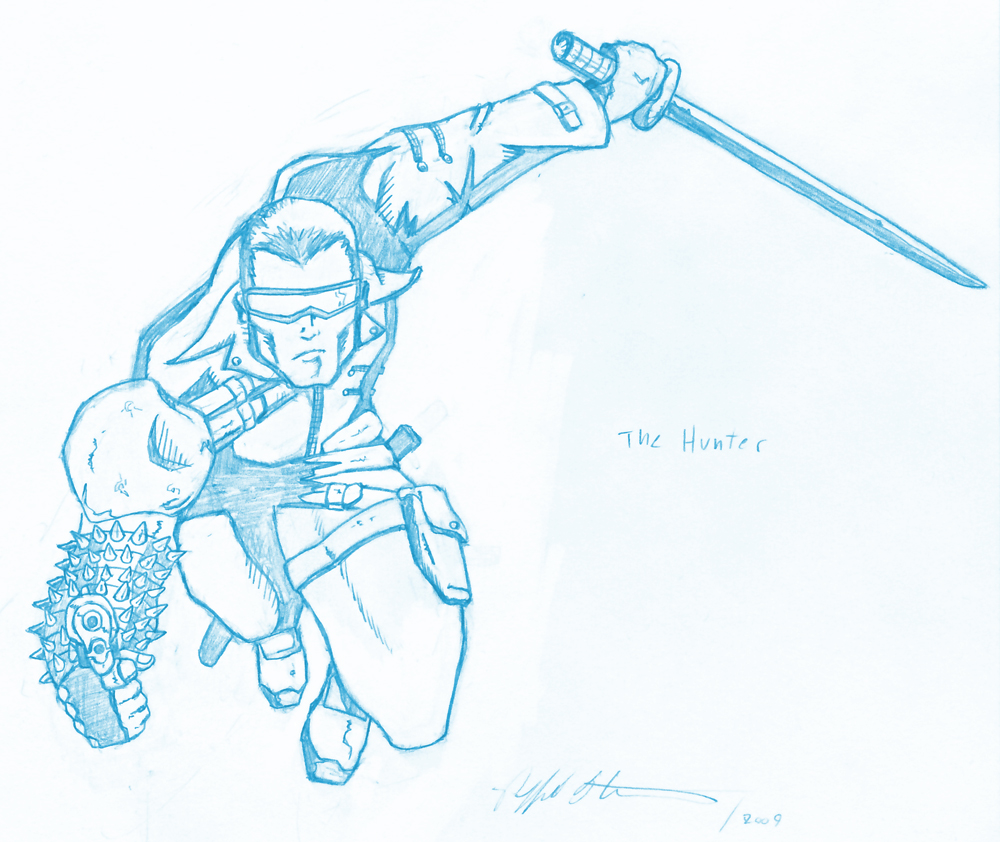
Hunter-Blue-Pencils
The Hunter Blue Pencils by Ralph Contreras

Now that I’ve got an awesome action pose drawing I was ready to ink it. I’ve been digitally inking my pencils for the past year. For this drawing, I wanted to go old school and ink with real ink, but I didn’t want to lose my original pencils. So I scanned the drawing and turned the pencil lines blue in Adobe Photoshop (being the crafty graphic designer I am). I then printed the pencils on card stock paper and was ready to ink traditionally.

Right on! My next post will show the cool inking of this Pin-up. So keep an eye out.
-Shazam!

This blog post was originally published on my former website, Comic Book Graphic Design and has now been migrated here to RSC Arts, Artist Blog.
The Hunter – Character Design – From Sketches to Final Ink – Part 1

The Hunter – Character Design – From Sketches to Final Ink – Part 1

I was going through some of my old sketches the other day. I have a personal treasury of character designs and comic book drawings. Back in the day, I would love to come up with new characters.  It seems I don’t draw as much now as I did back then (and I draw a lot now). I’d draw and come up with a new character every day.

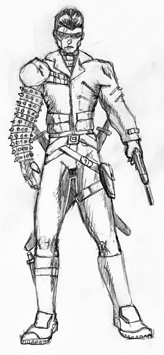
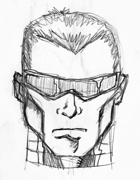
On one of my inspirational days, I can up with a character named Nemcromn. You can check out some redesign sketches I’ve done of him in a previous post, Nemcromn Character Design Sketches On that day I came up with both Nemcromn and his main adversary “The Hunter”. Here are the initial drawings of “The Hunter”. I had just seen the movie Blade and was really into Brom art at the time. I think his design is very much inspired by both.

The original design of The Hunter was done sometime between 1998-1999. Ten years later in 2009 I found my sketch and decided to change it up a bit. I redesigned  Nemcromn and wrote a new extensive biography for him and gave him a new adversary “The Radiant Guardian”. I decided to change  “The Hunter” too. He was now an assassin/hunter who now works for Nemcromn.  The Hunter and a new character I came up with, named the Grimm Creeper would now be Nemcromn’s most deadly assassins always trying to outdo each other in his favor. You can check out Grimm Creeper’s original and resign on a previous post Grimm Creeper, Hand Scythe Weapons

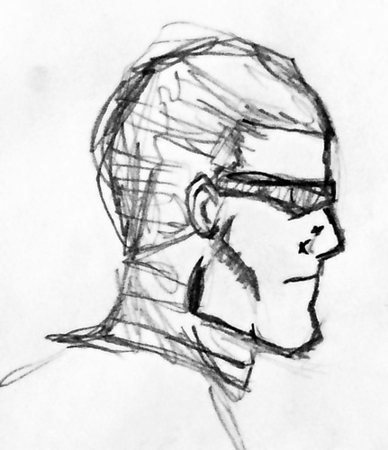
With the redesign, I made him a little bulkier. These are quick sketches to get the feel and general look of The Hunter. My drawing style has changed in 10 years when drawing a quick idea sketch I want to get his look down. These drawings look a little rough, what I’m trying to do is get my ideas down on paper before I lose them. I’m not as concerned about making them look perfect on these initial drawings, that will come later when I draw him in a pinup of some sequential pages.

In my next post I’ll be showing a Pin-Up drawing I did of “The Hunter”.  This will be a more defined drawing. So keep an eye out.

This blog post was originally published on my former website, Comic Book Graphic Design and has now been migrated here to RSC Arts, Artist Blog.
Privacy Policy - Terms and Conditions

Copyright © 2000-2024, All rights reserved unless otherwise noted herein.