Enchanted Inktober: The Lady of the Lake and Excalibur Illustration

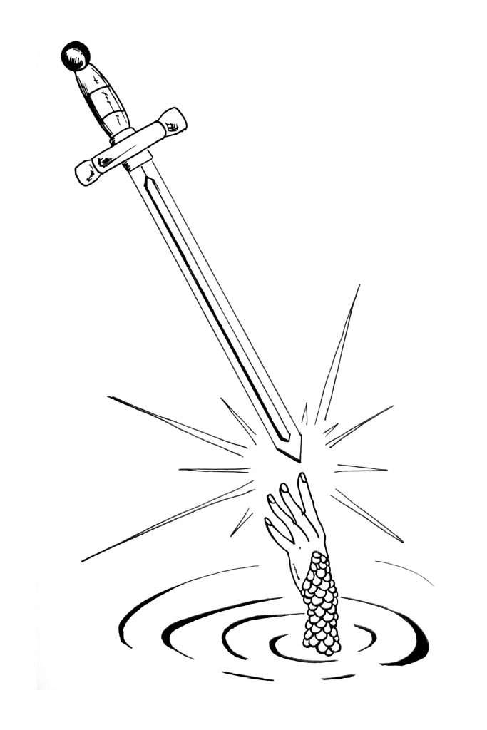
Enchanted Excalibur and The Lady of the Lake Ink Illustration

Exploring Legends with Ink: The Enchanted Sword of Excalibur

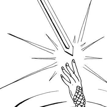
I got a little behind on my inktober illustrations this year. Here’s the illustration for the prompt Enchanted. There are so many great ideas that come to mind with this prompt. I was inspired to draw the famous enchanted sword of Excalibur.

Growing up one of my favorite movies was the 1981 film Excalibur. I always remember the scene where the lady of the lake both gives and takes back Excalibur. So for this ink illustration, I wanted to draw that: Excalibur and a magical enchanted scene with the lady of the lake.

This year I’ve been both drawing a sketch first or going straight to inks. For this one, I did draw a sketch first. Then I went over the illustration with an ink pen. I wanted the illustration to be simple and clear. So I didn’t draw that much in the way of background or foreground. I added ripples to show her hand reaching through the water. I also put a spark of enchanted energy as the center point of the ink drawing.
Unlocking Creativity: Exploring Croquis for Character Design

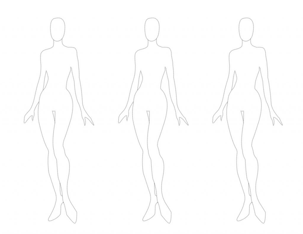
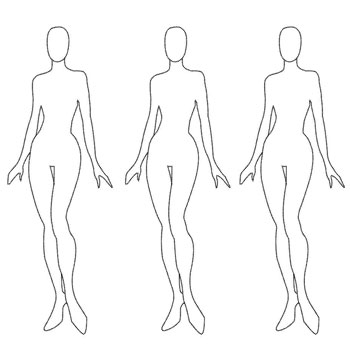
Example of Croquis Templates

Streamlining Character Creation: Embracing Croquis Templates

Character Design is one of my favorite things to do. In fact, I’ve probably created over 100 characters in the past few years. For my comic book, design challenges, and just for fun. but sometimes I feel like I’m spending way too much time just drawing the form. So I decided to give Croquis a try to let the creative juices flow. A Croquis is a figure template you can trace over and add a character’s costumes to.

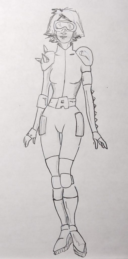
Character created using a Croquis Template

A few years ago I created a female Croquis for my other blog Comic Book Graphic Design. I took that template and extended it to have 3 figures. Here’s one of the characters I created using the Croquis. A Roller Derby type character with spikes. It was fun just to add the elements of the costume to the character and not have to worry about drawing the form. I traced the figure and added goggles, spikes, and a big “A” on her belt. She has a very 90’s X-Men feel, well at least to me, lol.

The Hunter – Character Design – From Sketches to Final Ink – Part 3

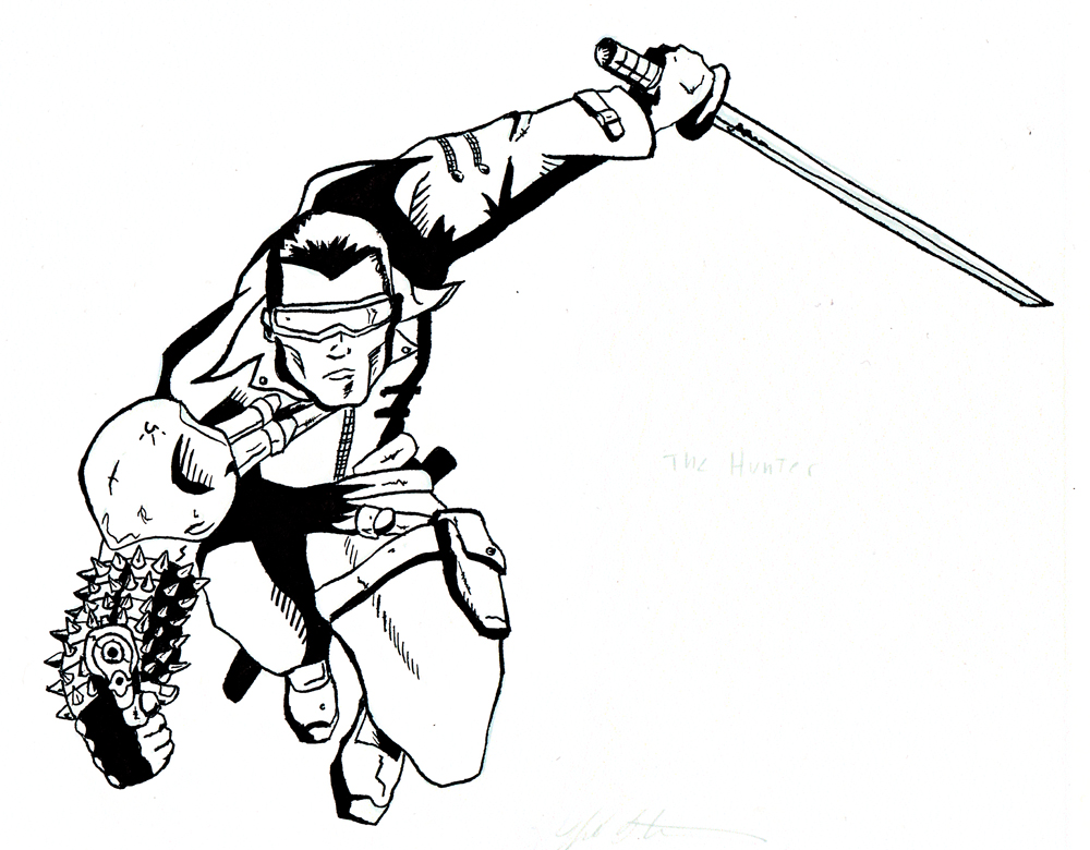
Hunter
The Hunter by Ralph Contreras

The Hunter – Character Design – From Sketches to Final Ink – Part 3

A few months ago I was looking through some of my old drawings. Ones I did while I was a kid up to when I was in college. I found my original sketches for a character named “The Hunter”.  I had redesigned his history and biography a few years ago, so I decide to redesign his look too.

For the past year, I’ve been digitally inking my pencils. I usually use Adobe Illustrator using vector points. I like using the pen tool to create crisp sharp/smooth lines. But for this inking, I wanted to go old school and use a real brush and pen. A process I do not use very often. I had a real blast inking it by hand!I didn’t want to lose my pencils so I scanned the original and reprinted them on card stock. I used Adobe Photoshop to replace the original black lines with blue lines. This way it would be easier for me to ink them.

Here are my final inks of “The Hunter” I had a real blast with this piece. I started with very rough sketches to tight pencils and finally to a finished inked piece. In my next blog post (that’s right I have one more to go) I’ll show you what I did to vectorize my final inks so I can print them at any size without losing the quality of the inks. – Shazam!

This blog post was originally published on my former website, Comic Book Graphic Design and has now been migrated here to RSC Arts, Artist Blog.

Privacy Policy - Terms and Conditions

Copyright © 2000-2024, All rights reserved unless otherwise noted herein.